The single biggest gallery wall mistake in 2026 is hanging art too high — the center of your arrangement should sit roughly 57–60 inches from the floor, not eye-level for a 6-foot adult. Most other failures (matchy-matchy frames, awkward gaps, floating arrangements above the sofa) trace back to skipping a paper template on the floor before you ever touch a nail.
If your gallery wall looks “off” but you can’t say why, you’re almost certainly making one of the 11 mistakes below. Each fix takes under 20 minutes, costs less than $15, and works in rentals where you can’t patch large holes.
Key Takeaways
- Hang the center at 57–60 inches from the floor — gallery height, not eye height.
- Keep 2–3 inches of negative space between frames; tighter looks crowded, wider looks disconnected.
- Above a sofa, art should span 60–75% of the furniture’s width — never less.
- Use kraft paper templates before nailing anything to avoid the “Swiss cheese” wall.
- Mix three frame finishes max (e.g., black, brass, natural wood) for cohesion without monotony.
- For renters: 3M Command strips rated 16 lb hold most framed prints under 20×24 inches without damage.
Mistake 1: Hanging Everything Too High
This is the error that ruins more gallery walls than any other, and it’s almost universal among first-time homeowners. The convention “hang art at eye level” makes sense in a museum where the average visitor is standing — but in your living room, half your viewing time happens from the sofa.
The fix: Treat 57 inches as the center line of your arrangement. This is the museum-and-gallery standard for a reason: it accommodates seated and standing viewers, and it visually connects art to furniture instead of leaving it floating near the ceiling.
If your gallery wall sits above a sofa, console, or bed, drop the bottom edge to 6–10 inches above the furniture. Any higher and the art reads as orphaned. Lower, and people start knocking frames with their heads.
Mistake 2: Skipping the Paper Template Step
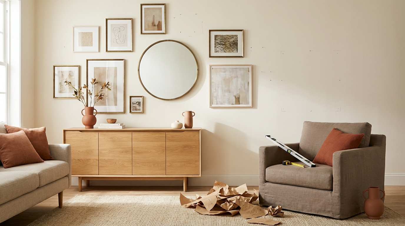
The temptation to “just start hanging and see how it looks” is the single fastest path to a wall pocked with extra holes. Even experienced stylists template first.
The fix: Trace each frame on kraft paper or newsprint, cut out the shapes, mark the nail location on each one (measure from the top of the frame to the hanging wire when pulled taut), and tape the templates to the wall with painter’s tape. Live with the arrangement for 24 hours. Move pieces around. Take a phone photo and look at it — distance and a camera screen reveal awkward gaps you can’t see in person.
Only after the paper layout looks right do you drive any nails. This single habit eliminates roughly 90% of repositioning damage.
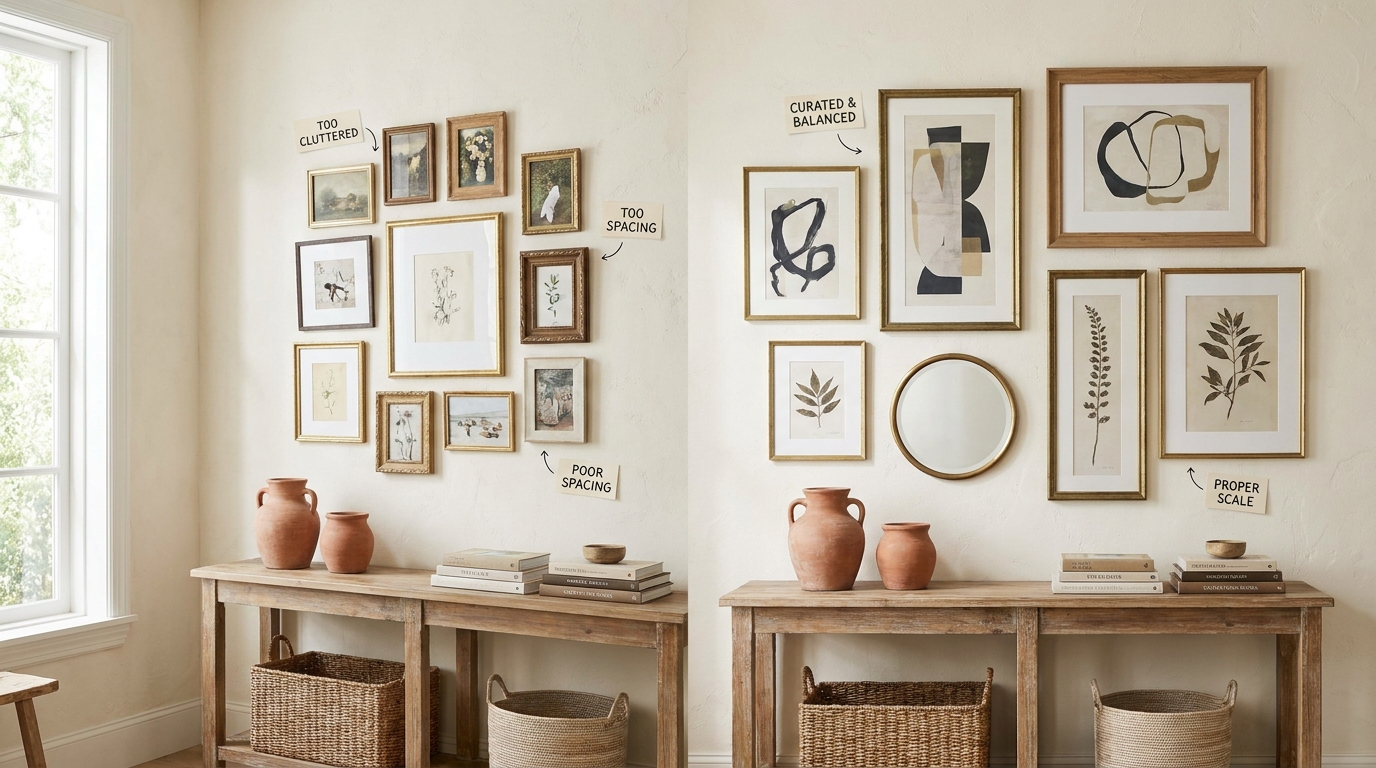
Mistake 3: Matchy-Matchy Frames
A wall of identical black frames with identical mats reads as corporate, not curated. Top-ranking design experts in 2025–2026 all converged on the same advice: variety creates the feeling of a collection built over time, which is what makes gallery walls feel personal.
The fix: Pick three frame finishes maximum and repeat each one at least twice. A reliable combination for the renter-to-homeowner aesthetic: matte black, warm brass, and natural oak. Mix mat widths too — some frames with generous mats, others mat-free.
What you’re avoiding is two extremes: the IKEA showroom (all identical) and the thrift-store explosion (no two frames related). Three repeating finishes split the difference.
Mistake 4: Inconsistent Negative Space
Even with mismatched frames, the gaps between them need to be consistent. When some frames sit 1 inch apart and others 4 inches apart, the eye reads chaos instead of composition.
The fix: Pick a number between 2 and 3 inches and use it for every single gap — vertical, horizontal, diagonal. Cut a piece of cardboard to that exact width and use it as a spacer when you hang each piece. The arrangement can be wildly asymmetric and still look intentional as long as the negative space is uniform.
Tighter than 2 inches and the frames visually merge. Wider than 3 inches and the pieces stop reading as a group.
Mistake 5: Art That’s Too Small for the Wall
A 5×7 print floating on a 10-foot wall above a sectional looks like an afterthought. This is the most common failure above sofas and beds — and it makes the entire room read as under-decorated.
The fix: The art (or art group) above a sofa should occupy 60–75% of the sofa’s width. For a standard 84-inch sofa, that’s a 50–63 inch span of artwork. You can get there with one large piece or with a cluster, but the total footprint matters more than any single frame.
The same rule applies above beds, consoles, and dressers. If you only own small prints, group them tightly — a 3×3 grid of 8×10s reads as one large piece.
Mistake 6: Ignoring the Wall’s Boundaries
Light switches, vents, thermostats, and trim are not enemies — they’re your composition’s frame. Gallery walls that crash into a vent or wrap awkwardly around a thermostat look unfinished, no matter how good the art is.
The fix: Decide your boundary box before you template. Mark the four corners with painter’s tape: top, bottom, left, right. Stay inside that rectangle. Leave at least 4 inches of clearance from any switch, outlet, or vent.
If a switch falls in the middle of your ideal wall, don’t fight it — either expand the arrangement to incorporate the switch as a deliberate void, or shift the whole composition 6 inches to one side.
Mistake 7: One Visual Anchor Missing
Without a clear focal point, your eye bounces around the wall with nowhere to rest. This is what makes some gallery walls feel “busy” even when each individual frame is beautiful.
The fix: Choose one piece — usually the largest, most colorful, or most personal — and place it slightly off-center in the arrangement. Everything else orbits this anchor. The anchor doesn’t need to be huge; it just needs to be clearly the biggest and ideally have the strongest color contrast against the wall.
A common professional move: put the anchor at the intersection of the rule-of-thirds grid (one-third in from a vertical edge, one-third up from the bottom edge of the arrangement).
Mistake 8: All Prints, No Texture
A flat wall of paper prints, even beautifully framed, lacks the depth that makes designed rooms feel layered. Reddit interior design communities consistently flag this as the “looks like a college dorm” giveaway.
The fix: Mix at least two non-print elements into every gallery wall. Options that work in rentals:
- Small mirrors (round brass-framed mirrors are having a moment in 2026)
- Hand-thrown ceramic plates mounted with disc hangers
- Pressed botanicals in float frames
- Small woven baskets (yes, on the wall)
- A vintage clock with a thin profile
The goal is shadow and dimensionality. Even one mirror in a wall of 12 frames changes the whole feel.
Mistake 9: Words, Words, Everywhere
Multiple framed prints with text — quotes, song lyrics, “Live Laugh Love” — overload the wall with reading. Visitors don’t relax; they decode.
The fix: Limit text-based art to one piece per gallery wall, maximum. Use it as your anchor if the typography is strong, but don’t repeat the device. Replace would-be quote prints with abstract color blocks, line drawings, or photographs.
This single edit is responsible for more “wow, that’s so much better” reactions than any other single fix in this list.
Mistake 10: Forgetting the Renter Math
If you’re renting, every nail hole is a future Spackle session. Most renters either over-commit (Swiss-cheese walls) or under-commit (one sad print taped up with washi tape).
The fix: Build the entire arrangement with damage-free hanging strips rated for the actual frame weight. Current 2026 product ratings:
| Strip Type | Weight Capacity | Best For |
|---|---|---|
| Small Command Strips | Up to 4 lb | Postcards, unframed prints |
| Medium Command Strips | Up to 8 lb | 8×10 framed prints |
| Large Command Strips | Up to 16 lb | 16×20 framed prints |
| Heavy-Duty Velcro Mounts | Up to 30 lb | Large frames, mirrors |
Weigh each frame on a kitchen scale before choosing. Frames near the upper end of a strip’s rating tend to slip in humid bathrooms or sun-warmed walls — size up one tier when in doubt.
For tile, glass, or textured wallpaper, switch to adhesive picture-hanging hooks designed for those surfaces; standard strips fail.
Mistake 11: Treating the Wall as Permanent
Gallery walls evolve. The biggest mistake among first-time homeowners is treating Version 1 as the final draft, then resenting it six months later when their taste has shifted.
The fix: Build with rotation in mind. Use the same frame sizes across multiple prints so you can swap art without re-templating. Keep two or three “bench” pieces in a closet — seasonal swaps (botanicals in spring, moody landscapes in fall) keep the wall feeling fresh without rebuilding from scratch.
This is also the cheapest decor refresh in any home: a $40 print swap reads as a brand-new wall.
How to Build a Gallery Wall the Right Way (5-Step Recap)
- Gather more frames than you need. Aim for 1.5x your final count so you can edit ruthlessly.
- Lay everything on the floor first in the rough shape of your wall. Photograph from above.
- Cut kraft paper templates for every piece. Mark nail positions on each template.
- Tape templates to the wall at 57-inch center. Use a level. Live with it 24 hours.
- Hang one frame at a time, starting with your anchor piece, using a consistent spacer.
If you’re working above furniture, the bottom edge of the lowest frame should land 6–10 inches above the sofa, console, or bed.
Renter-Friendly Bonus: The “No Nails” Gallery Wall
For renters who can’t put any nails in the wall (looking at you, NYC and London leases), a fully damage-free gallery wall is possible in 2026:
- Acrylic shelves (Command-strip mounted) holding leaning frames
- Picture rails with hook chains — common in older UK/US buildings
- Adhesive frame mounts designed for renters (brands like Hangman and Frame & Hang launched updated 2025 lines)
- Magnetic picture systems that bolt to a single removable strip
A leaning-frame arrangement on a single 4-foot shelf reads as a gallery wall with one hole in the wall — or zero if you use heavy-duty strips.
What’s Changed in 2026
A few shifts worth knowing about as you plan this year:
- Maximalist clustering is back. The minimalist single-print era (2019–2023) has rotated out. Dense, layered gallery walls with 12+ pieces are dominant in 2026 design coverage.
- Warm metals are replacing matte black. Brass and antique brass frames have overtaken black as the default neutral.
- Wide mats are back. Frames with 3–4 inch mats around small prints are reading as elevated and editorial.
- Asymmetric arrangements are preferred over grids. Perfect 3×3 grids now read as “phase 1 starter wall” rather than aspirational.
If your wall was built in 2022 or 2023, a refresh with two or three brass frames and one wider-matted print will modernize it without a full teardown.
Frequently Asked Questions
How many pieces should a gallery wall have?
For most living rooms, 7 to 12 pieces strikes the right balance. Fewer than 5 reads as a small arrangement rather than a gallery. More than 15 starts to overwhelm unless the wall is genuinely large (10+ feet wide).
What’s the right spacing between gallery wall frames?
2 to 3 inches of consistent negative space on every side. Use the same gap measurement throughout — varying gaps is what makes arrangements feel chaotic.
Should gallery wall frames all match?
No. Aim for three repeating frame finishes rather than one. All-matching reads as a store display; all-different reads as cluttered.
How high should I hang a gallery wall above a sofa?
The bottom edge of the lowest frame should sit 6 to 10 inches above the top of the sofa. The center of the entire arrangement should land near 57 inches from the floor.
Can renters do a gallery wall without nails?
Yes. Use Command strips rated for each frame’s actual weight (weigh on a kitchen scale), or build the arrangement on a single Command-mounted shelf with leaning frames. Both methods are fully damage-free.
What’s the biggest gallery wall mistake?
Hanging everything too high — typically because people aim for eye level rather than the gallery-standard 57-inch center. This single error makes art read as disconnected from the furniture below it.
Related Reading from Our Gallery Walls Hub
- Gallery Wall Layout Templates That Actually Work in Small Apartments
- How to Mix Frame Finishes Without Looking Cluttered
- The 57-Inch Rule: Hanging Art Like a Designer in Any Room
- Renter-Friendly Wall Decor: The 2026 Hardware Guide
- Gallery Wall Ideas Above the Sofa: 12 Layouts to Steal
Last updated June 2026. The Decor Note is reader-supported — when you buy through links in our gallery wall guides, we may earn a small commission at no cost to you. All product recommendations reflect editorial testing in real renter and first-time-homeowner spaces.