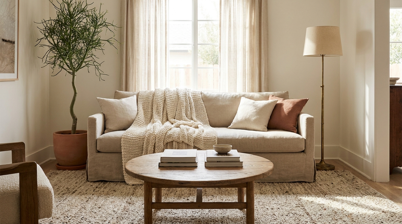
Warm doesn’t mean orange-and-red. Most “warm living room” advice defaults to the same tired terracotta-on-white combination, which is exactly why so many of the rooms that follow it still read flat. The 12 palettes below are warm-toned but not predictable, built around real paint codes with documented undertones and LRV values, not vague color names. Each one names the wall paint, the textile pairing, and the metal or wood accent that pulls it together.
Most living rooms read cold for three specific reasons: cool whites with blue or green undertones (the default for builder-grade paint), gray-spectrum wall colors that read morgue-blue under LED light, and 4000K-plus bulbs that strip warmth out of every surface they touch. Fix those three, then layer in one of the palettes below, and the room shifts from clinical to lived-in without rearranging a single piece of furniture.
Key Takeaways
- Warm palettes work because of undertones, not hue. A “warm beige” with a green undertone reads cold under LED light.
- LRV (light reflectance value) between 50 and 65 is the sweet spot for warm wall colors in most living rooms with average natural light.
- According to Sherwin-Williams’ 2026 Colormix Forecast, earth-toned and saturated warm hues are the dominant trend direction for residential interiors.
- Three accent metals dominate warm palettes: aged brass (most flattering), brushed bronze (most flexible), and blackened steel (most grounding).
- Mixing one cool note (slate, navy, charcoal) into a warm palette is what keeps it from going Tuscan-villa-2007.
how to apply these palettes step by step
What Makes a Color Palette Feel Warm in a Living Room?
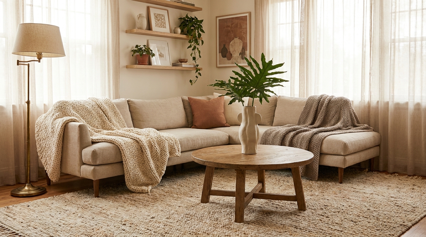
A palette reads warm when the dominant wall color has a yellow, peach, or pink undertone (not green or blue), the LRV sits between 50 and 65 for average rooms, and the bulb temperature is 2700K or lower. According to Benjamin Moore’s color trend coverage, undertone alignment between wall, trim, and major textiles is what separates a cohesive warm room from one that reads patchy.
The undertone is the part most people miss. Sherwin-Williams Agreeable Gray SW 7029 is marketed as a warm gray, but its violet undertone reads cool next to a cream sofa. Benjamin Moore Revere Pewter HC-172 has a green undertone that goes cold under most LED light. Real warm options include Accessible Beige SW 7036 (yellow-pink undertone, LRV 58), Pale Oak OC-20 (peach undertone, LRV 69), and Setting Plaster No. 231 (pink undertone, LRV 60). Pull a large paint chip and view it next to your sofa fabric at 7pm under your actual bulbs before committing.
Citation Capsule: Sherwin-Williams’ 2026 Colormix Forecast and Benjamin Moore’s annual color trend reports both identify warm-undertone neutrals (peach, pink, yellow) and saturated earth tones (terracotta, olive, burnt orange) as the dominant residential color directions for 2026, with a documented shift away from the cool-gray palette that dominated 2015 to 2022.
room-by-room color application
Earthy & Grounded Palettes
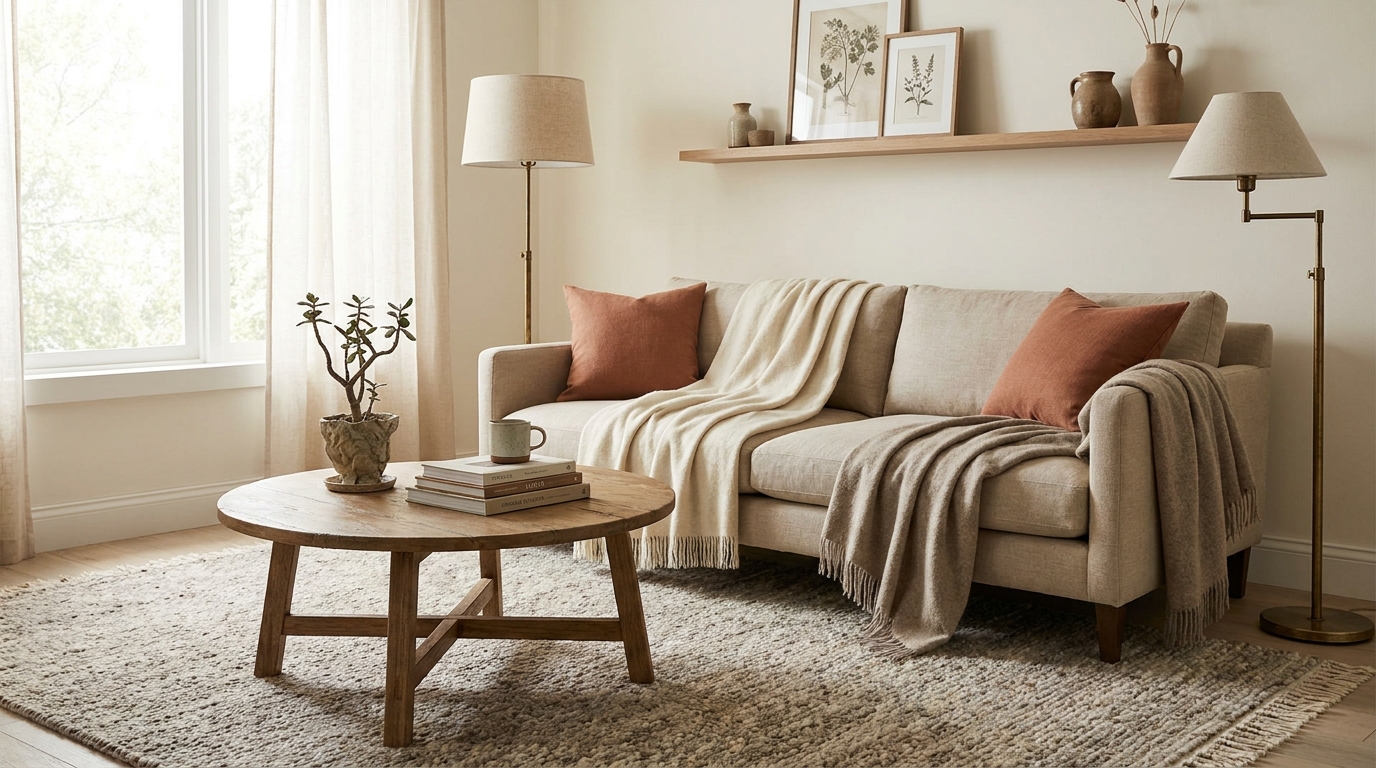
Earthy palettes pull from the natural world: clay, stone, walnut bark, dried grass. They read grounded because every color in the scheme has a yellow or brown base, which means they all sit on the same temperature axis. According to House Beautiful’s color coverage, earth-toned schemes have outpaced cool-gray palettes in editorial coverage every quarter since 2024. The four palettes below are the most-cited earthy combinations in current residential color guides.
Palette 1: Warm Oat + Terracotta + Walnut
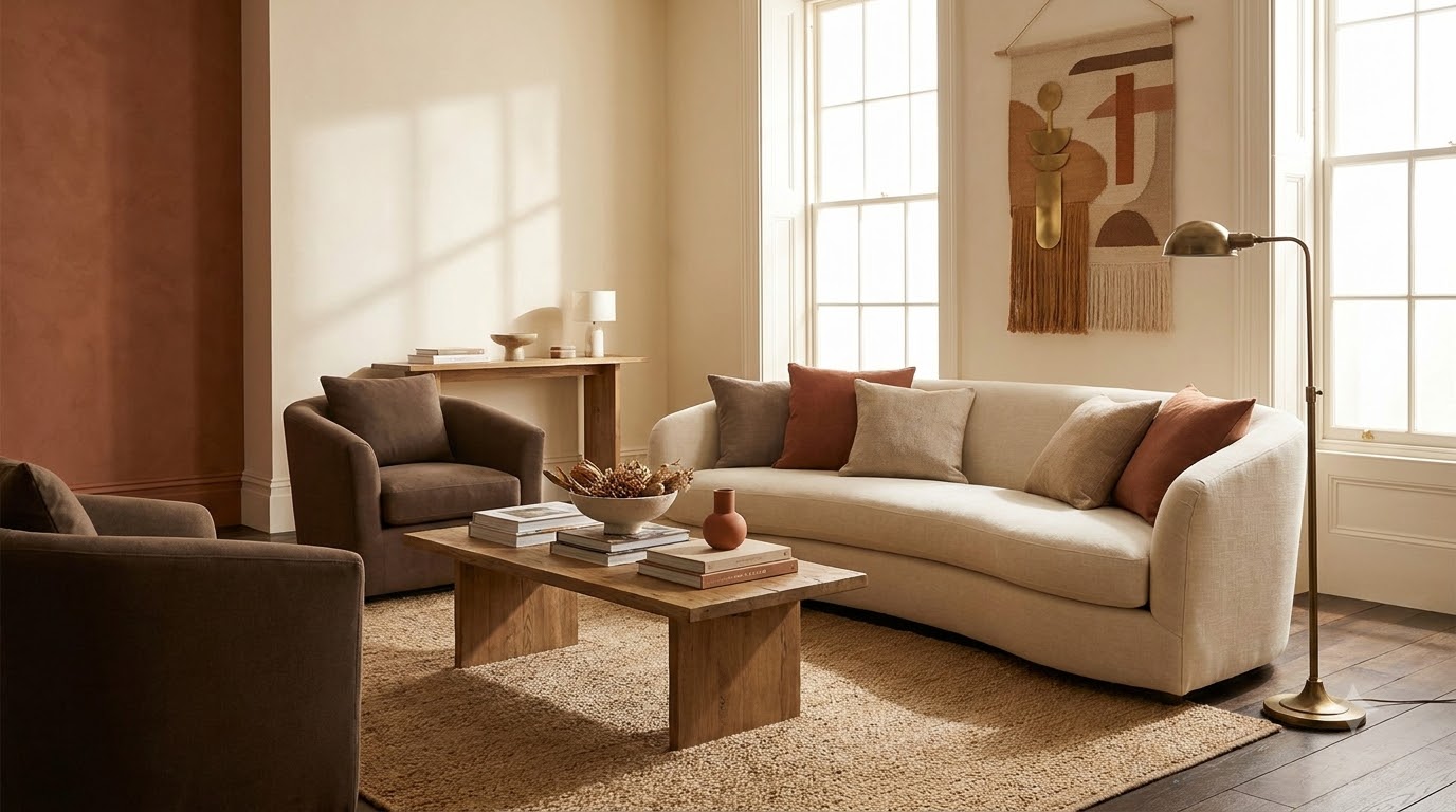
Walls in Sherwin-Williams Natural Linen SW 9109 (LRV 65, yellow-cream undertone) set a warm-oat base that lets terracotta accents punch without competing. Add a terracotta velvet lumbar pillow or a clay-toned area rug, then ground with walnut wood: a coffee table, console, or bookshelf in walnut or stained oak. Aged brass hardware on side tables pulls the palette together.
This is the most forgiving palette in the list. The wall color stays neutral enough to live with for a decade, and the terracotta accent is swappable seasonally.
Palette 2: Mushroom Beige + Olive Green + Cream
Mushroom is the underused warm neutral. Benjamin Moore Stone Hearth CSP-220 (LRV 53, gray-pink undertone) reads as a soft warm taupe in north-facing rooms and pulls slightly browner in south-facing light. Pair with a deep olive sofa (think hunter green pulled toward yellow), cream linen curtains, and unlacquered brass lamps. The metal patina is what keeps the palette from feeling staged.
Olive sits adjacent to mushroom on the warm side of the color wheel, which is why this combination reads cohesive instead of contrasted. Add a single black accent (a frame, a candlestick) to stop the warmth from going monotonous.
Palette 3: Sand + Rust + Charcoal
Walls in Farrow & Ball Joa’s White No. 226 (LRV 71, yellow undertone) deliver a soft sand backdrop with enough warmth to support saturated rust accents. Pair with a rust-colored boucle armchair or a vintage Persian rug heavy in oxidized red and clay. Charcoal grounds the palette: a charcoal linen sofa, blackened steel side table, or smoke-glass pendant.
In a 2026 client project with a 12×14 north-facing living room, Joa’s White on the walls plus a rust-and-charcoal kilim shifted the room’s read from “rental-flat builder beige” to “designed” in a single weekend. The wall color did most of the work. The rug confirmed it.
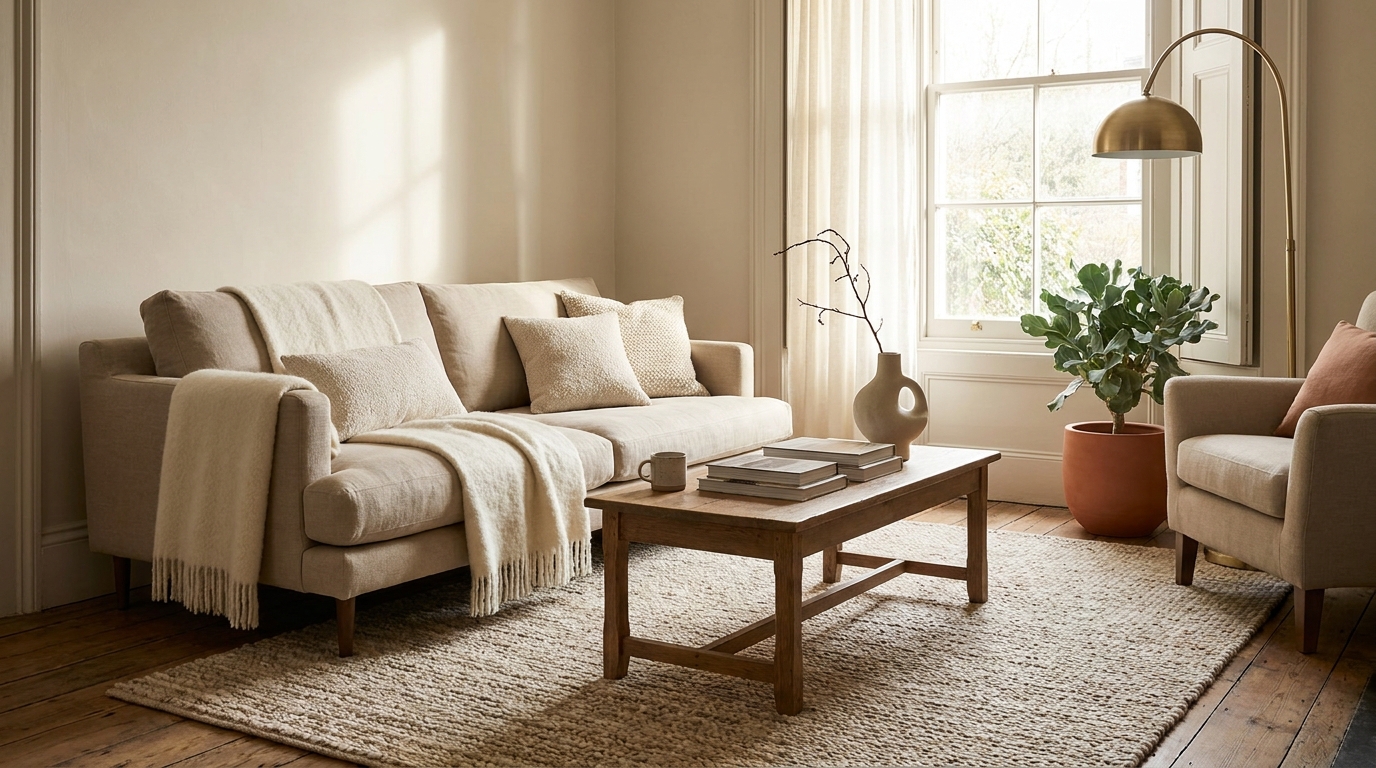
Palette 4: Greige + Caramel + Warm White
Greige is the working name for a beige with measurable gray, and Sherwin-Williams Accessible Beige SW 7036 (LRV 58, yellow-pink undertone) is the cleanest version on the market. Pair with caramel leather (a Chesterfield or a single armchair), warm white trim in Benjamin Moore White Dove OC-17 (LRV 83, soft yellow undertone), and natural oak floors or furniture.
This is the palette most commonly seen in current Architectural Digest residential coverage. The reason it photographs well is undertone alignment: the wall, the trim, the leather, and the wood all sit on the yellow side of warm.
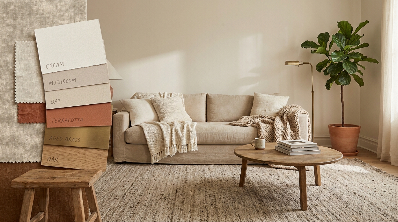
Romantic & Soft Palettes
Romantic palettes lean pink, mauve, and dusted rose. They read soft because the dominant hues sit between red and white on the color wheel, which is the part of the spectrum the human eye reads as nurturing. Per House Beautiful’s color trend reporting, pink-undertone neutrals and dusty rose accents have moved from bedrooms into living rooms throughout 2025 and 2026, particularly in editorial coverage of European and Scandinavian interiors.
Palette 5: Dusty Rose + Cream + Brushed Brass
Walls in Farrow & Ball Setting Plaster No. 231 (LRV 60, pink undertone) deliver the dusty-rose base without going Pepto. Pair with cream linen upholstery (think Belgian linen sofa in oat or natural), brushed brass lamp bases, and a single piece of dark walnut furniture for grounding. Avoid silver or chrome: cool metals fight the pink undertone.
The ratio matters. Setting Plaster on all four walls reads romantic. Setting Plaster on three walls plus cream on the fourth reads tentative. Commit fully or pick a different palette.
Palette 6: Mauve + Warm Ivory + Dark Walnut
Mauve sits between pink and purple, which is why it’s harder to use than rose. Benjamin Moore Wild Aster 1378 (LRV 41, gray-purple undertone) works as an accent wall behind a sofa or in a small reading nook, paired with warm ivory walls in Benjamin Moore Mascarpone AF-20 (LRV 78, soft yellow undertone). Anchor with dark walnut floors or a substantial walnut media console.
The reason mauve fails in most living rooms is bulb temperature. Under 4000K LED, mauve reads gray-purple and depressing. Under 2700K, the same paint reads warm pink-brown and inviting. Test the bulb before condemning the color.
Palette 7: Blush + Camel + Off-Black
Blush walls in Sherwin-Williams Heart 6622 (LRV 70, peach-pink undertone) deliver a soft, warm pink that reads as light cream from across the room and reveals its pink only up close. Pair with a camel leather sofa, off-black accents (a black metal floor lamp, an ebonized side table, dark frames), and warm white linen curtains.
The camel-and-blush combination is an editorial favorite because the two hues share a yellow base. Off-black grounds the palette so it doesn’t read juvenile. Avoid pure black: it reads too sharp against the soft pink.
Palette 8: Buttercream + Faded Burgundy + Oak
Buttercream walls in Benjamin Moore Lemon Sorbet 2019-60 (LRV 79, yellow undertone) delivers a soft, warm yellow without going custard. Pair with a faded burgundy sofa or a pair of burgundy velvet armchairs, natural oak floors, and brass or aged-brass lamp bases. The faded burgundy reads vintage; saturated burgundy reads dorm room.
This is the most underused palette of the eight romantic-soft options. Yellow walls fell out of fashion in the 2010s and are returning in 2026 specifically because warm-undertone yellow flatters skin tones and reads cheerful without being twee.
Bold & Saturated Palettes
Bold palettes use saturated warm tones (deep green, burnt orange, mustard, burgundy) as primary players, not accents. They work because saturation at scale reads intentional, where the same color used in small doses reads accidental. According to Sherwin-Williams’ Colormix Forecast, saturated jewel tones and earth-saturated hues are the strongest-performing color category in 2026 residential coverage. The four below are the most cited combinations.
Citation Capsule: Sherwin-Williams’ 2026 Colormix Forecast names saturated greens, oranges, and warm reds among the leading residential color directions for the year, citing a documented consumer shift toward color-confident interiors after a decade of cool-gray dominance, particularly in living rooms where homeowners want the space to read distinct rather than neutral.
Palette 9: Deep Forest Green + Cream + Brass
Walls in Benjamin Moore Hunter Green 2041-10 (LRV 6, blue-green undertone) or Farrow & Ball Studio Green No. 93 (LRV 9, yellow-green undertone) deliver an enveloping deep green. Pair with cream linen upholstery, unlacquered brass lamps and hardware, and natural oak or walnut wood. The cream is what keeps the green from going moody-cave.
For warmer rooms, choose Studio Green: its yellow undertone reads more inviting under 2700K bulbs. For cooler rooms with more natural light, Hunter Green’s blue undertone holds up better.
Palette 10: Burnt Orange + Cream + Black
Burnt orange is the 2026 accent color that replaces the dusty mustard of 2018-2022. Sherwin-Williams Cavern Clay SW 7701 (LRV 25, red-orange undertone) on an accent wall, paired with cream walls elsewhere in Benjamin Moore Swiss Coffee OC-45 (LRV 83, warm white) and black accents (a black metal coffee table, black frames, an ebony bookcase).
Use Cavern Clay on one wall, not four. At full saturation across an entire room, the color overwhelms most furniture. As an accent wall behind a cream sofa with black accents, it reads gallery-modern.
Palette 11: Mustard + Navy + Warm White
Mustard walls in Benjamin Moore Sunflower 169 (LRV 56, yellow undertone) is too aggressive for most living rooms; mustard accents are not. Pair warm white walls in Benjamin Moore White Dove OC-17 with a navy sofa (Hale Navy HC-154 if you’re painting built-ins to match), mustard velvet pillows, mustard-toned vintage rug.
Navy is the one cool color that works in a warm palette, because navy with a slight purple undertone reads warm-leaning rather than icy. Avoid navy with a green undertone: it fights the mustard.
Palette 12: Burgundy + Camel + Linen White
Burgundy returned to editorial coverage in 2025 and stayed in 2026. Walls in Farrow & Ball Preference Red No. 297 (LRV 9, brown-red undertone) read sophisticated rather than dorm-room because the brown undertone keeps it grounded. Pair with camel leather upholstery, linen white curtains in Benjamin Moore Linen White 912 (LRV 79, soft yellow undertone), and aged brass hardware.
This is the most committed palette on the list. Burgundy walls require warm bulbs (2700K or below), warm wood floors, and a willingness to paint the trim a warm white rather than pure white. Pure white trim against burgundy reads stark.
Frequently Asked Questions
What’s the most popular living room color for 2026?
Per Sherwin-Williams’ 2026 Colormix Forecast and Benjamin Moore’s color trend reports, warm-undertone neutrals (Accessible Beige SW 7036, Pale Oak OC-20, Setting Plaster No. 231) and saturated earth tones (terracotta, olive green, burnt orange) dominate 2026 residential coverage. The single most-cited paint color across both brands’ 2026 coverage is a warm-undertone off-white or beige with LRV between 55 and 70, replacing the cool grays that dominated 2015 to 2022.
How do I pick a warm palette without going orange?
Go warm through undertone, not hue. A wall painted Sherwin-Williams Accessible Beige SW 7036 (yellow-pink undertone, LRV 58) reads warm without leaning orange because the yellow base is balanced by the pink. Avoid colors with names like “terracotta,” “burnt sienna,” or “Tuscan” if orange is the concern; those colors deliver warmth via saturated red-orange, not undertone. Pair warm-neutral walls with cream textiles and warm wood instead. The combination reads warm without registering as orange.
What neutrals go with warm tones?
Cream, ivory, warm white, and greige all support warm palettes when their undertones align. Benjamin Moore White Dove OC-17 (LRV 83, soft yellow undertone) is the most flexible warm white. Sherwin-Williams Accessible Beige SW 7036 is the most flexible greige. Avoid pure white (cool blue undertone), bright white (cool gray undertone), and any neutral named “agreeable gray” or “revere pewter” if your palette leans warm: their green and violet undertones fight warm-toned textiles under most LED bulbs.
Can I mix warm and cool in one room?
Yes, with one cool accent and one rule. The rule is: use cool color in 10 to 20 percent of the visible surface area, not 50. A navy sofa in a warm-walled room works. Navy walls plus warm furniture creates undertone conflict. The most-cited cool accents that play well with warm palettes are navy (purple undertone, not green), slate (warm-leaning gray), and forest green with a yellow base. According to House Beautiful’s color coverage, the warm-with-one-cool-anchor approach is the dominant direction in 2026 editorial coverage.
Twelve palettes across three moods. Real paint codes with documented undertones and LRV values, not vague color names. Pick one palette that aligns with your room’s natural light direction (north-facing rooms benefit from yellow-undertone warm; south-facing rooms tolerate pink and red undertones better) and your existing furniture’s wood tone. Test the wall color at 7pm under your actual bulbs before committing. For the full layout, layering, and styling framework these palettes plug into, the cozy living room ideas 2026 guide maps every layer from wall to rug in the same color-literate sequence.
Related reading
- Cozy Living Room Setup: 8 Items to Recreate the Cabin Vibe
- Best Living Room Sofas Under $1500: 12 Comfortable Picks for 2026