
Here is the quick verdict: choose neutral fall decor if you want a calm, layered look that carries from September through the holidays and blends with year-round furniture, and choose traditional fall decor if you love the warmth of harvest colors and want the season to feel unmistakably present the moment guests walk in. Neutrals in cream, oat, and sage suit open-plan rooms, renters, and anyone who redecorates slowly; traditional burnt orange, rust, and deep red suit cozy, defined spaces and people who go all-in on autumn. After styling both in our own home for several seasons, we found neutrals are cheaper to maintain and traditional palettes deliver more instant impact. Neither is “better” – it depends on your rooms, your budget, and how much change you actually enjoy.
Key Takeaways
- Neutral fall decor (cream #F5F0E6, oat #E3D9C6, sage #A9B29F, taupe #B7A99A) reads calm, layered, and transitions past Thanksgiving without a swap.
- Traditional fall decor (burnt orange #C1440E, rust #A63A24, deep red #7B1E22, brown #5A3E2B) reads cozy, festive, and high-impact but is more seasonally locked.
- Neutral setups cost less to refresh because textures, not colored props, do the work; traditional setups lean on more seasonal buys.
- Use the 60/30/10 ratio either way: 60% base, 30% secondary, 10% accent keeps both styles from looking flat or chaotic.
- You can blend both – a neutral base with a few traditional accents is the most forgiving path for most homes.
What defines neutral fall decor?
Neutral fall decor trades saturated harvest color for tone-on-tone warmth and texture. Instead of shouting “autumn” with orange, it whispers it with nubby wool, dried grasses, matte ceramics, and soft off-whites. The season shows up through material and shape – a bundle of wheat, a chunky knit throw, a bowl of pale gourds – rather than through a color change. This is why the look holds up long after the pumpkins are gone.

When we shifted our living room to a neutral scheme, the biggest surprise was how little we had to store afterward. A cream throw and oat pillows simply stayed out into winter. Below is the core palette we return to every year.
- Cream #F5F0E6 – the base for walls, large throws, and ceramics.
- Oat #E3D9C6 – pillows, table runners, and woven baskets.
- Sage #A9B29F – the “living” accent via eucalyptus, olive branches, or a single glazed vase.
- Taupe #B7A99A – grounding tone for candles, trays, and stoneware.
Design outlets have noticed the shift too. Homes & Gardens (2025) reports designers moving away from burnt orange toward marigold, chocolate and toffee tones, and warm neutrals, and Etsy (2025) flags cocoa, mossy sage, and warm ochre as rising fall shades. Pantone’s 2026 Color of the Year, Cloud Dancer, a soft white (Pantone, Dec 2025), points in the same warm-neutral direction. If you want a longer starting point, our guide to fall color palette ideas for the home breaks down how to build a scheme room by room.
What defines traditional fall decor?
Traditional fall decor is the classic harvest look: warm, saturated color layered over natural wood and candlelight. It leans into the emotional shorthand most of us grew up with – orange pumpkins, red-brown leaves, and amber glow. It is the more immediate of the two styles, and it photographs beautifully, which is part of why it never really goes out of fashion.
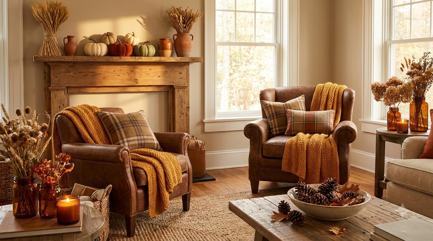
In our dining room we keep the traditional palette because the space is only “on” a few weeks a year, and we want it to feel like autumn instantly. These are the anchor colors we use.
- Burnt orange #C1440E – the signature accent for pumpkins, candles, and stems.
- Rust #A63A24 – throws, napkins, and dried floral tones.
- Deep red #7B1E22 – berries, chargers, and a moody focal layer.
- Brown #5A3E2B – wood, leather, and woven textures that ground the brights.
Traditional does demand more discipline. Without a neutral anchor, four warm colors compete and the room reads busy. That is where the 60/30/10 ratio earns its keep – and where a controlled focal point, like a styled mantel, keeps the whole scheme from tipping into clutter. Our walkthrough on how to style a fall mantel shows the layering order we use.
How do neutral and traditional fall decor compare?
The fastest way to decide is to see the two side by side across the factors that actually change your day-to-day: palette, mood, cost, best room, and upkeep. This is the one comparison we hand friends who ask which way to go.

| Factor | Neutral fall decor | Traditional fall decor |
|---|---|---|
| Palette | Cream #F5F0E6, oat #E3D9C6, sage #A9B29F, taupe #B7A99A | Burnt orange #C1440E, rust #A63A24, deep red #7B1E22, brown #5A3E2B |
| Mood | Calm, layered, understated, modern | Cozy, festive, nostalgic, high-impact |
| Cost to refresh | Lower – reuses year-round textiles, few seasonal buys | Higher – more color-specific seasonal pieces |
| Best room | Open-plan living rooms, bedrooms, entryways | Dining rooms, defined cozy dens, tablescapes |
| Upkeep | Easy – transitions into winter, minimal storage | Higher – clear seasonal swap in and out |
Notice that “best room” is where these two really diverge. Neutrals thrive where autumn needs to coexist with the rest of your home; traditional thrives where you can commit a whole space to the season for a few weeks.
Which style fits your home and budget?
Budget shapes this decision more than most people expect. A neutral scheme is cheaper over time because you are buying texture, not color – and texture rarely goes out of season. A traditional scheme costs a little more each year because the colored props are pulled out and put away. Here is how the typical spend breaks down for a single room, using accessory price ranges we consistently see.
- Throw pillows: $15-$40 each – neutrals double as year-round; traditional colors are seasonal-only.
- Knit or woven throw: $25-$60 – one good neutral throw outlasts several trend buys.
- Candles and holders: $10-$30 – amber and taupe glass work for either palette.
- Stems, gourds, or dried grasses: $8-$25 – the fastest, lowest-cost way to signal the season.
- Table runner or linens: $18-$45 – the single biggest “traditional” color hit for a dining space.
If money is tight, we always suggest starting neutral and adding one or two traditional accents – it is the cheapest way to test the season without committing. For a full low-spend plan, our cozy fall living room ideas on a budget shows how to layer a room for very little, and our roundup of the best fall decor finds under $25 is where we grab those single-accent pieces.
How do you apply the 60/30/10 ratio to each style?
The 60/30/10 ratio is the guardrail that keeps both palettes from failing. Sixty percent is your dominant base, thirty percent is a supporting tone, and ten percent is the accent that adds spark. The colors change with the style, but the math stays identical – and once we started using it, both our neutral and traditional rooms stopped looking either washed-out or overloaded.
- Neutral 60/30/10: 60% cream #F5F0E6 base, 30% oat #E3D9C6 support, 10% sage #A9B29F accent.
- Traditional 60/30/10: 60% brown #5A3E2B base, 30% rust #A63A24 support, 10% burnt orange #C1440E accent.
- Blended 60/30/10: 60% neutral base, 30% neutral support, 10% one traditional accent like deep red #7B1E22.
Keep the 10% accent to genuinely small doses – a few pumpkins, one throw, a candle cluster. Overshooting the accent is the most common way a good palette goes wrong, which we cover alongside other pitfalls in fall decorating mistakes to avoid.
How do the two styles play out room by room?
Rather than picking one style for the whole house, we assign a style per room based on how the space gets used. That single change made autumn feel intentional instead of scattered. Here is the split that works for us and most homes we help.
- Living room: neutral base for longevity, since it stays styled from September into winter.
- Dining room: traditional, because a tablescape is a short, high-impact moment worth going bold on.
- Entryway: neutral with one traditional accent – the low-commitment “welcome” zone.
- Bedroom: neutral, layered with warm textiles for a restful, un-busy feel.
- Kitchen: either – small props like a runner or bowl of gourds decide the mood cheaply.
For the bold dining moment, our fall tablescape ideas lean traditional on purpose, while a soft, low-cost bedroom update is exactly what our cozy fall bedroom refresh under $100 is built around.
Can you blend neutral and traditional fall decor?
Yes – and honestly, blending is what we recommend to most first-timers. A neutral base with a controlled hit of traditional color gives you the calm of one style and the warmth of the other, and it is far more forgiving than committing fully to either. The key is letting neutrals carry the 60/30 and reserving the traditional color for the 10% accent only.
- Start with a cream and oat base you can leave up for months.
- Add sage or eucalyptus for a living, non-orange fall cue.
- Introduce one traditional accent – a rust throw or a cluster of burnt-orange pumpkins.
- Keep wood and leather tones as the bridge between both palettes.
- Remove the single traditional accent after the season and the room resets to neutral instantly.
If you want warm combinations that already balance neutral and saturated tones, our living room color palette with 12 warm combinations is a useful reference for picking that one accent without clashing.
Frequently Asked Questions
Is neutral fall decor cheaper than traditional?
Usually, yes, over time. Neutral schemes rely on textures like cream throws and oat pillows ($15-$40) that stay out year-round, so you buy fewer season-specific pieces. Traditional palettes need colored props pulled out and stored each autumn, adding recurring cost. Blending the two keeps spending lowest while still feeling seasonal.
Does neutral fall decor still look like fall?
It does, as long as texture and natural elements do the work. Dried wheat, pale gourds, chunky knits, and sage stems read as autumn without any orange. In our home the neutral living room reads clearly seasonal, just quietly. If you worry it looks too plain, add one traditional accent at the 10% level for warmth.
Which style transitions best into winter and the holidays?
Neutral wins here. Cream, oat, and taupe carry straight into winter, so you swap almost nothing when the pumpkins come down. Traditional burnt orange and rust feel distinctly autumnal and usually need a full changeover for December. This is the main reason we keep our high-traffic rooms neutral and save traditional color for the dining room.
What is the easiest way to start if I am unsure?
Start neutral, then add a single traditional accent you can remove later. Build a cream-and-oat base, layer sage for a living cue, and drop in one rust throw or a few burnt-orange pumpkins. This costs the least, commits you to nothing, and lets you feel out how much color you actually want before buying more.
How many accent colors should each style use?
Follow the 60/30/10 ratio and cap the accent at roughly ten percent of what you see. Neutral rooms use sage as that accent; traditional rooms use burnt orange. Going beyond one clear accent is where rooms start to feel busy. Keeping brown, wood, and leather as grounding tones lets the accent stay small but still register.
Sources
- Homes & Gardens (2025) – designers moving away from burnt orange toward marigold, chocolate/toffee, and warm neutrals.
- Etsy (2025) – rising fall shades: cocoa, mossy sage, warm ochre.
- Pantone (December 2025) – 2026 Color of the Year, Cloud Dancer, a soft white.