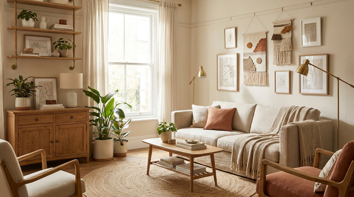
A gallery wall lives or dies by its color palette. You can have museum-quality art and the perfect layout, but if your frames clash with your prints and your prints clash with your wall, the whole thing reads as cluttered instead of curated. The good news: the rules for mixing frames and art are simpler than Pinterest makes them look.
Quick Answer: What’s the Best Color Palette for a Gallery Wall?
Stick to two or three core colors pulled from your art, then anchor the palette with neutrals (white, cream, black, or warm wood tones). Keep at least 60% of your frames in one finish — black, natural wood, or brass — and let the remaining 40% bring in accent finishes. Repeat each color at least twice across the wall so nothing feels stranded, and leave your wall paint as a quiet backdrop rather than a competing fourth color.
Key Takeaways
- A working gallery wall palette has 2–3 core colors plus neutrals, not five competing hues.
- Frame mixing follows a 60/40 rule: one dominant finish, one accent finish.
- Color repetition is what makes a mismatched-looking wall feel intentional.
- The wall paint behind your gallery counts as a color — treat it as part of the palette.
- For renters, damage-free hanging strips make palette experiments low-risk.
Why Color Palette Matters More Than Layout
People obsess over gallery wall layouts — grid, salon-style, organic — but layout is just geometry. Color is what makes the wall feel like one thing instead of a pile of separate decisions.
When your eye scans a successful gallery wall, it picks up a rhythm: the same mustard yellow appearing in three places, the same warm black frame repeating across the cluster, the same cream mat tying together a photograph and a botanical print. That rhythm is the palette doing its job.
When the palette fails, you’ll feel it before you can name it. One print pulls toward cool blues, another toward warm terracottas, the frames are a random mix of glossy black and orange oak, and the whole arrangement looks like a moving sale.
Step 1: Build Your Core Palette (2–3 Colors Plus Neutrals)
The simplest framework for a gallery wall color palette is the 60-30-10 rule, borrowed from interior design:
- 60% dominant color — usually a neutral that appears in most frames, mats, and the wall itself
- 30% secondary color — a recurring tone that shows up in 3–5 pieces of art
- 10% accent color — a punchy hue that appears in 1–2 places for energy
A workable example for a beige rental wall:
| Role | Color | Where it shows up |
|---|---|---|
| Dominant (60%) | Warm white / cream | Mats, two prints, wall paint |
| Secondary (30%) | Warm black | Frame finish on 5 of 8 pieces |
| Accent (10%) | Burnt orange | One large print, one small ceramic shelf piece |
If you’re starting from scratch, pull your palette from your hero piece — the largest or most personally meaningful artwork. Identify its three most prominent colors with a free tool like Coolors’ image-to-palette extractor, then let those colors govern every subsequent choice.
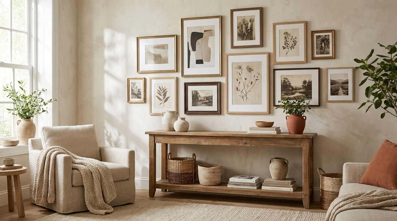
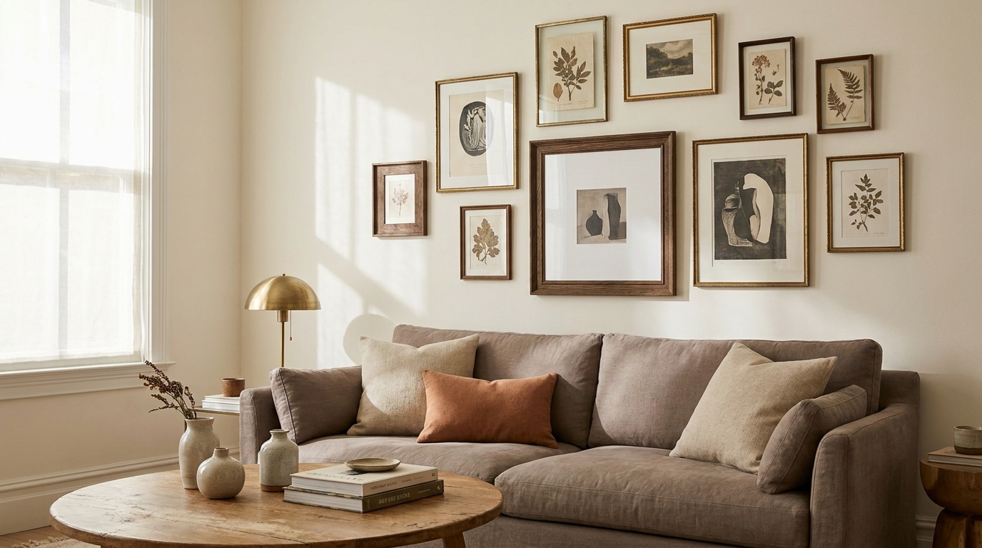
Step 2: The Frame-Mixing Rules That Actually Work
Frames are where most gallery walls go sideways. Renters and first-time buyers often inherit a mismatched stash — a few black IKEA frames, a thrifted gold one, the natural wood set from a wedding gift — and try to use all of them at once.
The 60/40 Frame Finish Rule
Pick one dominant finish for at least 60% of your frames. The other 40% becomes your accent finish. That’s it. Three finishes is the absolute maximum, and only if you have a wall of 12+ pieces.
Workable two-finish combinations:
- Warm black + natural oak — the most forgiving, works in nearly any room
- Brass + cream/white — soft and editorial, leans feminine
- Walnut + matte black — modernist, reads expensive
- Whitewashed wood + brushed nickel — coastal and airy
- Distressed oak + antique brass — warm, vintage-leaning
Avoid combining polished gold with polished silver unless you’re going for a maximalist look, and skip glossy black with matte black in the same cluster — the finish mismatch reads as a mistake rather than a choice.
Frame Width Matters as Much as Color
A 0.5-inch slim metal frame and a 2-inch chunky wood frame send different signals even if both are black. To keep a mixed-finish wall cohesive, match frame profiles within each finish group. All your black frames can be thin; all your wood frames can be chunky. The contrast becomes intentional instead of random.
When Matting Saves the Wall
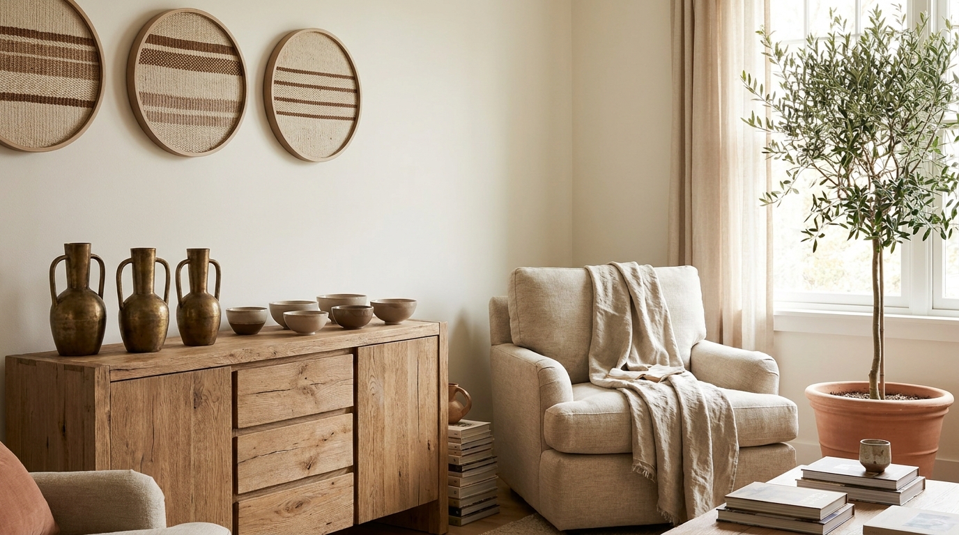
A generous white or cream mat (2–3 inches wide) does two things: it gives small prints visual weight, and it creates a neutral buffer between a busy artwork and a busy frame. If you’re stuck with frames you can’t change, add custom mats to unify the wall — it’s the cheapest fix in the entire decor playbook.
Step 3: Choose Art That Reinforces (Not Fights) the Palette
Once your color framework is set, art selection gets easier. You’re not looking for “art you like” — you’re looking for art that fits the palette you’ve already committed to.
The Three-Bucket Method for Art Selection
Sort every candidate piece into one of three buckets:
- Anchor pieces — large works that contain all 2–3 core colors. These are your visual gravity. You need 1–2 of these.
- Echo pieces — medium works that contain at least one core color plus neutrals. Most of your wall is this. Aim for 5–7.
- Punctuation pieces — small works in a single bold color or texture (a graphic print, a small object, a textile fragment). 2–3 max.
If a piece doesn’t fit any bucket, it doesn’t go on this wall. Save it for somewhere else.
Mixing Art Types Without Breaking the Palette
Photography, prints, paintings, textiles, and dimensional objects can absolutely coexist — but each medium brings its own color behavior:
- Black-and-white photography reads as a neutral and counts toward your dominant color
- Botanical prints carry green that needs to be either a core color or buffered with heavy matting
- Vintage posters often have a yellowed paper tone that pairs naturally with cream mats and brass frames
- Children’s art and personal mementos belong on a separate, smaller wall — they fight any curated palette
Step 4: Match the Palette to Your Wall Color
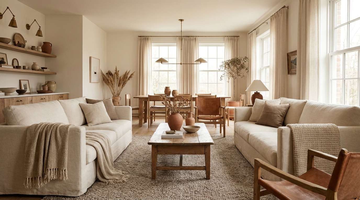
Your wall is the fourth color in any gallery wall, whether you planned for it or not. Match the palette to the wall, not the other way around — repainting a whole room is rarely an option, especially for renters.
Best Gallery Wall Palettes by Wall Color
| Wall Color | Works With | Avoid |
|---|---|---|
| White / Off-white | Almost anything — black frames pop, brass glows, color-heavy art shines | Pure white mats can disappear into the wall |
| Warm beige / greige | Warm black, oak, brass, terracotta accents, earthy art | Cool grays, icy blues, chrome frames |
| Cool gray | Matte black, walnut, navy/teal art, brushed nickel | Warm brass, mustard yellow, orange wood |
| Sage / muted green | Natural oak, cream mats, botanical and pink-toned art | High-contrast black frames everywhere |
| Deep navy / charcoal | Brass, gold, white mats, light/bright art | Dark wood frames (they disappear) |
| Terracotta / clay | Cream, brass, walnut, blue-green accents | Pastels, cool-toned photography |
Renters stuck with builder-beige or apartment-grade off-white have the easiest palette flexibility. Renters with bolder paint should treat the wall as the dominant color in the 60-30-10 split and let frames and art play supporting roles.
Step 5: Repetition Is the Secret Ingredient
A gallery wall feels intentional when every color appears at least twice, ideally three times, spread across the arrangement.
Pick a color from one piece of art, then deliberately repeat it elsewhere — in another print, in a mat, in a small object on a picture ledge. The eye reads repetition as “the designer meant this.” Without repetition, every color reads as an accident.
The same rule applies to frame finishes: don’t put your only brass frame in a corner. Pull repeating elements diagonally across the wall so the eye travels through the whole composition instead of getting stuck on one zone.
Step 6: Lay It Out Before You Hang It
Color decisions look different at scale. A palette that works in your phone gallery may fall apart on an 8-foot wall. Before you put a single hole in drywall:
- Lay every piece flat on the floor in the rough shape of your wall.
- Photograph it from directly above with your phone.
- Convert the photo to grayscale in your phone’s editor. If the gallery still reads as balanced in black and white, your contrast levels are working. If certain pieces disappear or scream, swap them out.
- Trace each frame on craft paper, cut out the templates, and tape them to the wall with painter’s tape to test spacing before committing.
This whole process takes about 45 minutes and saves the average gallery wall from at least three nail-hole regrets.
Renter-Friendly Hanging Without Damage
If you’re in a lease, hanging hardware decisions are part of the palette equation — heavy frames need real anchors, and not every wall can take them.
- Command Picture Hanging Strips hold up to 16 lb per pair and remove cleanly. Great for everything except oversized canvases.
- Monkey hooks and toggle anchors for heavier frames, but check your lease — most leases tolerate small nail holes if you fill them.
- Picture ledges are the renter’s secret weapon: a single ledge requires only two anchors, and you can rearrange the entire palette anytime without touching the wall again. Ideal for renters who want to experiment.
A 3-foot floating ledge from most major retailers runs $20–$40 and holds a curated mini-gallery without committing to layout permanence.
Common Gallery Wall Palette Mistakes
Even with a clear framework, a few mistakes show up over and over:
- Too many frame finishes. Three is the maximum; two is better. If you have four, donate the odd one out.
- No neutral breathing room. A wall that’s all saturated color exhausts the eye. White mats and negative space are part of the palette.
- Ignoring undertones. Two “black” frames from different brands can be cool-black and warm-black. Hold them side by side in daylight before committing.
- Using every print you own. Editing is design. A 6-piece curated wall beats a 14-piece chaotic one every time.
- Forgetting the wall paint. A cool gray wall sabotages a warm-toned palette no matter how good the art is.
A Sample Palette You Can Copy Tonight
For renters working with a warm-white or beige wall who want a low-risk, high-reward starting point:
- Frames: 5 warm black thin metal + 3 natural oak (60/40 split)
- Mats: All warm white, 2.5-inch borders
- Anchor: One 24×36 abstract print in cream, terracotta, and warm black
- Echo pieces: 4 botanical or line-drawing prints in black ink on cream
- Punctuation: 1 small textile fragment in terracotta, 1 small framed vintage postcard
- Wall color: Existing warm white (no repaint required)
Total cost using framed prints from Society6, Etsy print shops, and a quick Michaels frame run: around $180–$240 for an 8-piece wall.
The Bottom Line
A gallery wall color palette isn’t a Pinterest mood board — it’s a set of constraints that make every subsequent decision easier. Pick two or three colors plus neutrals. Stick to one dominant frame finish with one accent. Repeat every color at least twice across the wall. Treat your wall paint as part of the palette. And edit ruthlessly before you hang.
Get the color right, and the layout almost designs itself.
Frequently Asked Questions
How many colors should a gallery wall have?
Two or three core colors plus neutrals (white, cream, or black). More than three competing hues usually reads as cluttered rather than curated.
Can you mix black and gold frames on the same gallery wall?
Yes, as long as one finish dominates (around 60%) and the other plays an accent role. Avoid splitting them 50/50 — that reads as indecision rather than design.
What’s the best wall color for a gallery wall?
Warm white and off-white are the most flexible because they let frames and art carry the palette. Deep navy and charcoal work beautifully but require lighter, brighter art to avoid swallowing the wall.
Should all frames on a gallery wall match?
Not necessarily. A perfectly matched set looks formal and museum-like; intentional mixing (two finishes, similar profiles) reads as more collected and personal.
How do you tie together a gallery wall with mismatched frames?
Unify with mats. Adding 2–3 inch cream or white mats to every piece — regardless of frame finish — creates a visual rhythm that makes mismatched frames feel deliberate.