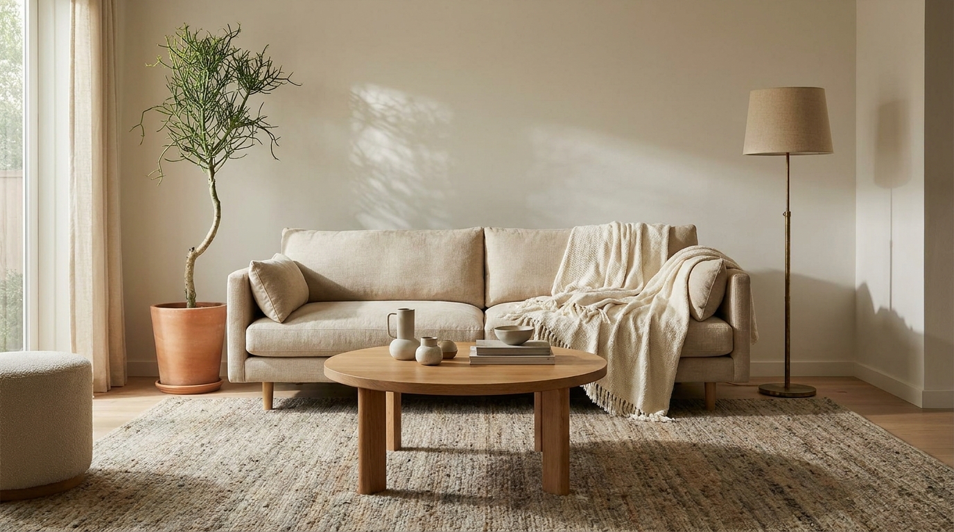
Most living rooms that feel “off” aren’t under-furnished or under-decorated. They have a rug that’s two sizes too small, a sofa pressed flat against every wall, and art hung at a height that makes sense in a gallery but not in a home. The mistakes are invisible until someone names them. Once named, you can’t unsee them in your own room.
The good news: most of these fixes cost under $50 or nothing at all. The mistakes, if left in place, quietly drain hundreds of dollars worth of furniture and effort of their visual return. These 10 are the ones that show up in living rooms consistently: in apartments, in houses, in rooms with $200 sofas and rooms with $2,000 ones.
full cozy living room framework
Key Takeaways
- A rug smaller than 8×10 under a standard sofa group makes the entire seating area float disconnected from the floor.
- All overhead lighting with no accent sources is the single most common reason a furnished room reads cold.
- Sofa against every wall is a comfort instinct that kills conversation distance and room scale at the same time.
- Art hung with the center above 60 inches from the floor is above eye level. It reads like it’s trying to escape the room.
- According to Apartment Therapy, rug sizing and lighting layering are the two most-cited mistakes in reader-submitted living room makeovers.
Why Does My Living Room Feel Off Even With Nice Furniture?
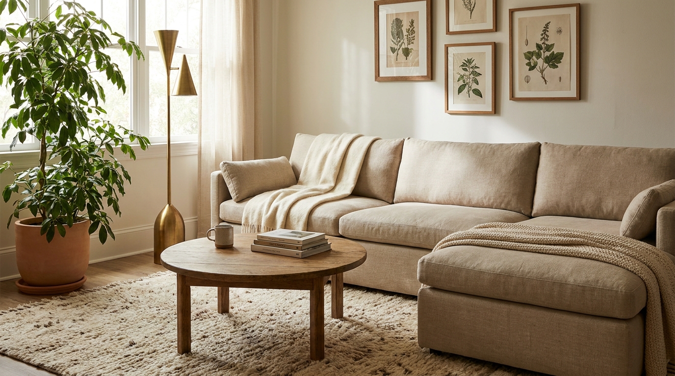
Nice furniture in a room that still feels wrong almost always has a layout or proportion problem, not a furniture problem. According to House Beautiful’s living room styling guides, the three most common culprits are rug sizing, lighting sources, and furniture placement relative to the room’s center, not the walls. These are fixable in a weekend without replacing a single piece.
The disconnect between furniture quality and room feel comes down to a few invisible rules most people were never taught. A sofa pushed against the wall reads like furniture in storage, not a conversation space. A rug that doesn’t anchor the seating group makes everything float. One overhead light flattens a room no matter how expensive the fixture. These aren’t taste problems. They’re proportion problems with specific solutions.
After reviewing reader-submitted living room photos across Q4 2025 and Q1 2026, the pattern was consistent: rooms that felt unfinished despite good furniture had at least three of these ten mistakes active at the same time. Fixing two of them (usually the rug and the lighting) shifted the room’s read more than any new purchase had.
Citation Capsule (Apartment Therapy): Apartment Therapy’s living room makeover coverage consistently identifies rug sizing and lighting layering as the top two fixes cited in reader before-and-after posts, above paint, above new furniture, and above any accessory purchase. Rooms with a correctly sized rug (front legs of all seating on the rug) and at least two light sources at different heights read as intentional regardless of budget. (Apartment Therapy Living Rooms, 2025)
Mistake 1: The Rug Is Too Small for the Seating Group
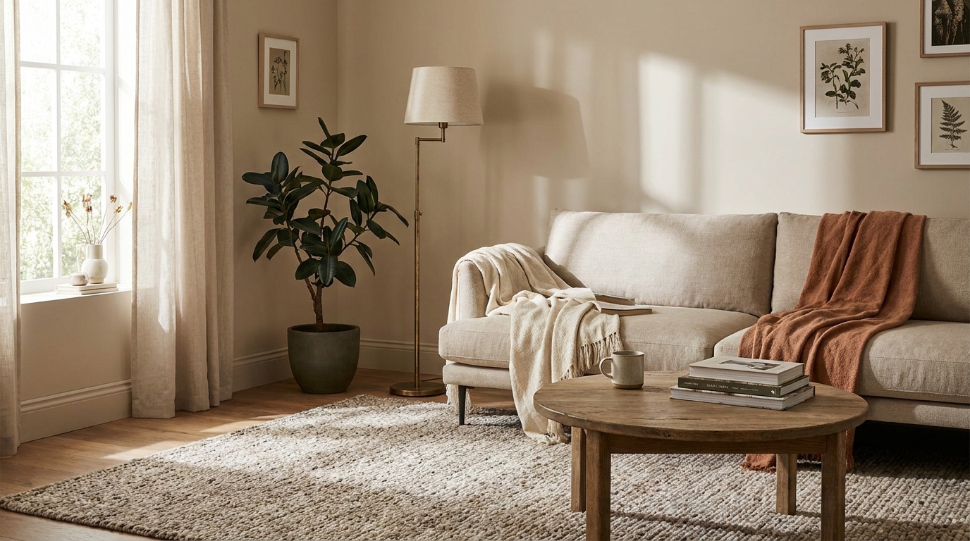
A 5×7 rug under a standard three-seat sofa with a coffee table in front leaves the two armchairs floating on bare floor. The seating group reads as disconnected pieces, not a unified zone. This is the most common living room mistake across every room size and budget level.
The rule is simple: in a standard living room, the rug should be large enough for the front two legs of every piece of seating to rest on it. For a sofa-plus-two-chairs arrangement, that means 8×10 at minimum. In a larger room, go 9×12. The rug defines the conversation zone. If the zone has no floor anchor, the furniture looks like it was left where movers put it.
The fix is replacing the 5×7 with an 8×10. Rugs Union carries a solid jute 8×10 for $189 that works in any neutral living room. World Market’s Heriz-style flatweave hits $229. If the budget is tight, layer a smaller rug on top of a low-cost sisal base: a $79 sisal from Ruggable plus an existing 5×7 rug stacked on top gets close to the right scale effect.
Renter note: rugs are fully renter-safe. The only constraint is whether the room has hard floors or carpet. On carpet, a rug pad with grippy backing ($24 at Home Depot) keeps the rug from shifting.
Mistake 2: All Overhead Lighting, No Accent Sources
A room lit entirely from one overhead fixture is a room that looks like a hallway. Overhead light casts downward shadows, flattens surfaces, and makes everyone in the room look tired. According to Architectural Digest’s living room coverage, layered lighting (overhead plus two accent sources at different heights) is one of the most cited improvements in professional room refreshes.
The fix is two accent light sources at seat height or lower. A floor lamp behind one end of the sofa, a table lamp on the console or sideboard, or a plug-in sconce on the wall beside the armchair. All three are renter-safe. All three plug in. None require an electrician.
A TorchStar arc floor lamp ($89) behind the far end of the sofa is the fastest single addition. Add one table lamp with a warm 2700K bulb on the console table across the room, and the lighting triangle is set. Total investment: under $120. The overhead fixture stays on a dimmer or gets turned off entirely in the evening.
Renter note: plug-in sconces with adhesive cable clips are fully renter-safe. Use 2700K bulbs throughout for consistent warmth. Mixing color temperatures (one 2700K lamp beside a 4000K overhead) creates visual discord that no amount of furniture rearranging will fix.
Mistake 3: Sofa Pushed Against Every Wall
Pushing the sofa against the wall is an instinct. It feels like it creates more space in the center of the room. It doesn’t. It creates an awkward gap between furniture and generates conversation distances that are too wide to feel comfortable. The typical result is 12 to 14 feet between sofa and chairs, where the ideal conversational range is 8 feet or less.
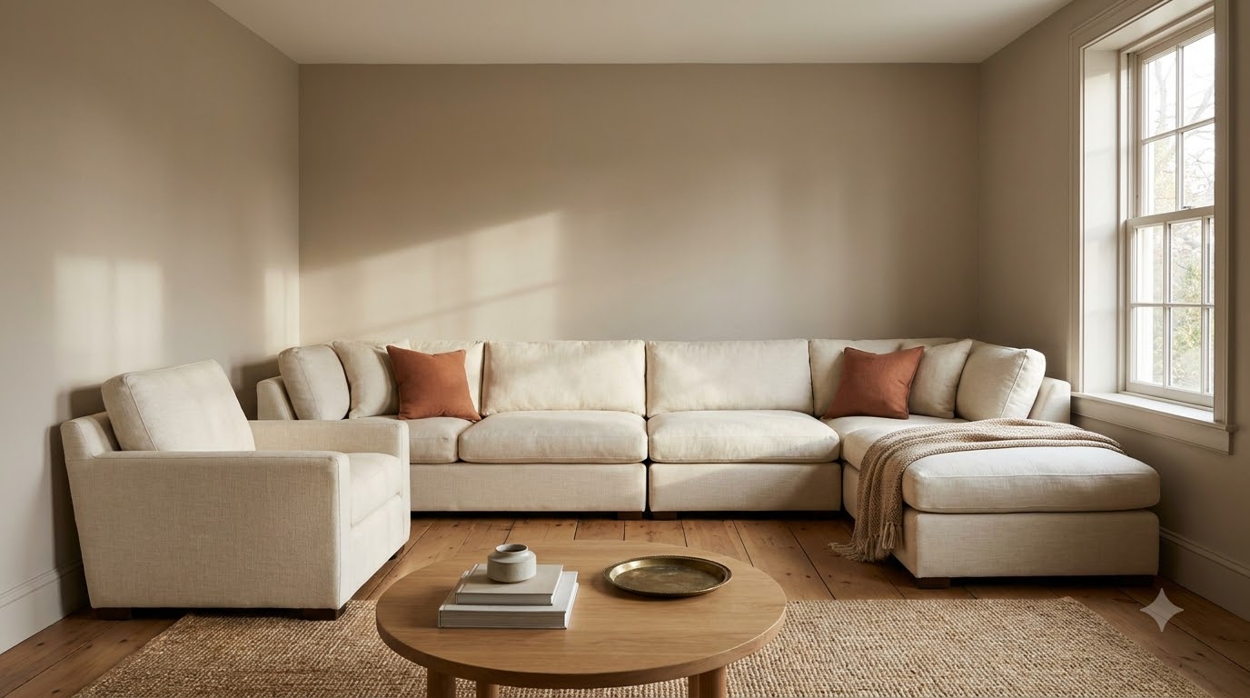
Pull the sofa 12 to 18 inches away from the wall. Float the chairs across from it with the coffee table between them. The seating group now defines the room’s center, and the space behind the sofa becomes a walkway that reads as intentional rather than accidental. The room feels larger, not smaller, because it has clear zones.
No new furniture needed. This fix costs nothing and takes 10 minutes to try. If the sofa blocks a window when floated, bring it 8 inches forward. Even partial floating reads better than wall-flat.
Mistake 4: Throw Pillows All the Same Size
A sofa with four 20×20 square pillows lined up in a row looks like a pillow display at a department store. It reads symmetrical but not styled. The eye has nothing to move through, so it moves on.

The fix is a mix: two 22×22 squares at the far ends, two 18×18 squares inside those, and one lumbar (14×20) at the center. That’s five pillows in two sizes plus a shape change. The lumbar is what completes the arrangement. Without it, even a two-size square arrangement stays flat. IKEA’s GURLI pillow covers at $7 each pair well with any lumbar from Amazon or Target.
The pillow mistake isn’t just size. It’s the absence of a horizontal element. A room styled with only square pillows has no horizontal line on the sofa surface. The lumbar provides it. One lumbar pillow does more visual work than two additional squares.
Keep pillow count to five or fewer on a standard three-seat sofa. Six pillows reads as stuffed. Three square pillows with no lumbar reads as unfinished. Five in mixed sizes reads as styled.
Mistake 5: TV Mounted Too High
The standard mounting height for a TV over a fireplace puts the screen at 60 to 72 inches from the floor. The recommended viewing height (center of screen at seated eye level) is 42 to 48 inches from the floor. Watching a screen 20 inches above eye level produces neck strain within 30 minutes and makes the room read like a sports bar.
The fix for a fireplace mount is to tilt the TV down using an articulating wall mount that allows a 15-degree downward tilt. Mounting Dream’s full-motion mount ($45) handles most 40 to 75-inch TVs and tilts to the correct angle. For TV stands, position the stand so the center of the screen sits at 42 to 45 inches from floor level.
If the TV is already mounted over a fireplace and the mount can’t be lowered, an articulating arm that extends and tilts is the renter-safe workaround. It doesn’t fix the height, but the tilt reduces neck strain significantly and makes the screen read as part of the room rather than as a billboard above it.
Mistake 6: Coffee Table Too Far From the Sofa
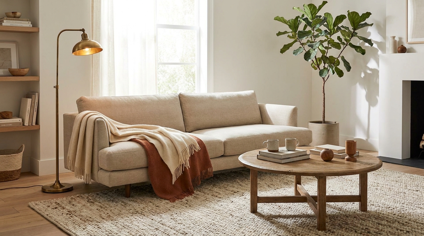
A coffee table placed more than 18 inches from the sofa edge is too far to use. People won’t lean forward to set down a drink or reach for a book. The table becomes a visual object with no functional purpose, and the space between it and the sofa reads as dead zone.

The correct distance is 14 to 18 inches between the sofa front edge and the coffee table edge. Close enough to reach a drink without standing up. Far enough to walk through when the room is in use. Slide the coffee table toward the sofa until that gap is correct. This also tightens the seating group visually, which improves the room’s overall proportion.
No new furniture needed. This is a slide-and-check fix. Measure the gap. If it’s over 18 inches, move the table forward.
Mistake 7: Art Hung Too High
Gallery walls and framed prints hung with the center at 72 to 80 inches from the floor look correct to the person who hung them because they were standing when they made the decision. Seated, the art sits above the line of vision and reads as disconnected from the furniture below it. The standard museum rule is 57 to 60 inches from floor to the center of the artwork. That’s the number.
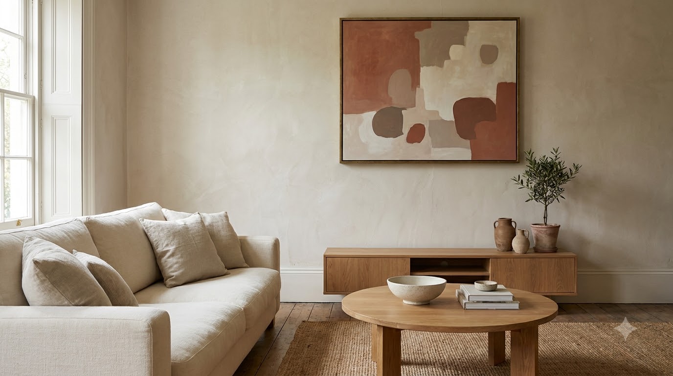
The fix is to rehang. Mark 57 inches on the wall in pencil, measure to the hanging hardware on the back of the frame, subtract, and put the nail at the right height. It takes 20 minutes and costs the price of one new nail hole. Command picture-hanging strips (5-lb rated, $8 for a pack of four) are the renter-safe version, no new nail needed.
For art above a sofa, the bottom edge of the frame should sit 6 to 8 inches above the sofa back. That’s typically around 38 to 42 inches from the floor for a standard sofa. The “57 to 60 inch center” rule applies to standalone wall art with no furniture below it.
Mistake 8: No Anchor Point in the Room
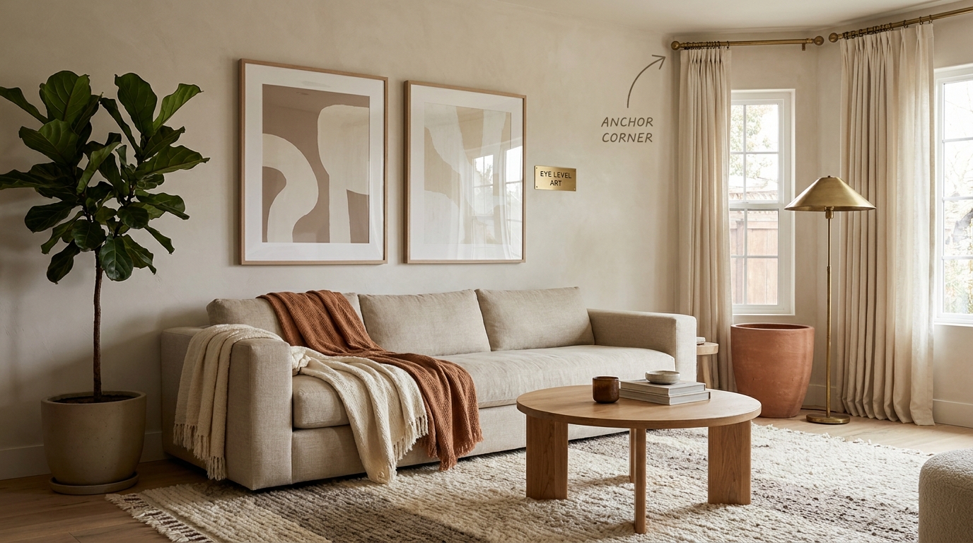
A room with a sofa, a TV stand, two chairs, and a coffee table, arranged correctly with the right rug, can still feel random if there’s no single spot the eye lands on when it enters. That spot is called the anchor point, and most living rooms don’t have one.
An anchor point is a corner with enough visual weight to stop the eye: a tall bookshelf with objects grouped in thirds, a floor lamp beside a single chair with a small side table and a plant, or a console table along the entry wall with a mirror above it. It doesn’t need to be large. It needs to be intentional.
The fix costs $0 if you rearrange what you have, or $40 to $80 if you add a floor plant and a basket. A 6-foot fiddle leaf fig or a tall snake plant in a rattan basket at $65 from Home Depot placed in the dead corner beside the bookshelf or beside the entryway immediately gives the eye something to anchor on.
Citation Capsule (House Beautiful): House Beautiful’s room styling guides identify the absence of a clear visual anchor point as one of the top reasons a furnished room reads as “unfinished” despite having all necessary furniture. A single corner treatment (plant, lamp, and side table) consistently resolves the “random furniture collection” read without adding new large-scale pieces. (House Beautiful Living Rooms, 2025)
Mistake 9: Curtain Rod Too Low and Curtains Too Short
Curtain rods mounted at window frame height (typically 80 to 84 inches from the floor) and curtains that end two inches below the rod make windows look small and ceilings look low. The fix is to mount the rod 4 to 6 inches below the ceiling (or at 84 to 96 inches in a standard 8-foot room) and use curtains long enough to graze or pool on the floor.
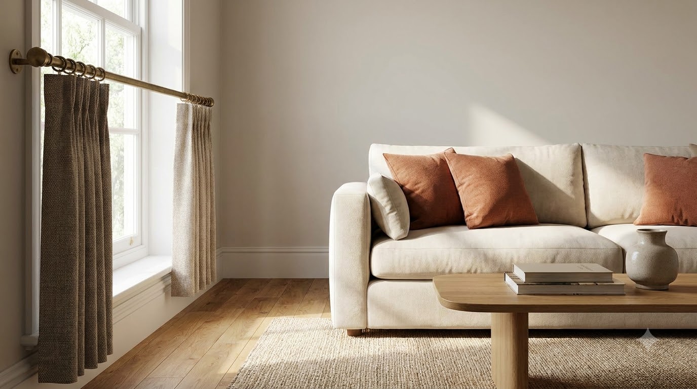
Floor-to-ceiling curtains make 8-foot ceilings read as 10-foot. The rod placement is the mechanism. The curtain fabric is secondary. IKEA’s LENDA curtains at $30 per pair in white or linen work in most rooms. They’re 118 inches long, which is right for ceiling-mount rods in standard rooms.
Renter note: Command curtain rod clips (rated 20 lb, $12 for a pack) hold a tension rod with curtains in place without drilling for windows up to 100 inches wide. For heavier curtains, a tension rod inside the window frame is the safest no-drill option, but it limits the rod to window width rather than wall-to-wall.
full curtain and window guidance
Mistake 10: All Surfaces Cluttered or All Empty, With No Middle Ground
A living room where every surface has objects on it reads as chaotic. A living room where every surface is bare reads as staged or sterile. Both are mistakes. The correct state is three to four styled surfaces with everything else cleared, and empty surfaces left deliberately empty rather than accidentally bare.
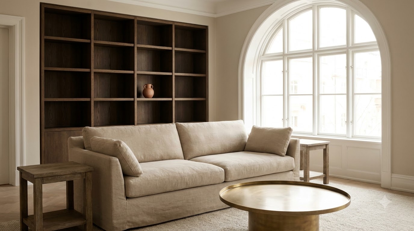
The rule for styling a surface: group objects in odd numbers (three is the easiest), vary height within the group (tall, medium, short), and include one natural element (plant, dried branch, stone, wood). A coffee table with a tray holding three objects, a side table with a lamp and a single book, and a console with a mirror and a plant equals three styled surfaces. The remaining surfaces stay clear.
The fix is editing, not buying. Clear every surface in the room completely. Then add objects back in groups of three, one surface at a time, until you have three to four styled points and nothing else. Resist adding a fourth object to a tray that already has three. It shifts from styled to cluttered with one piece.
Frequently Asked Questions
Which of these living room mistakes is most common?
The rug-too-small mistake is the most common, followed immediately by all-overhead lighting. According to Apartment Therapy’s living room coverage, rug sizing and lighting layering are the two most-cited fixes in reader-submitted before-and-after posts. Both mistakes are active simultaneously in most rooms that feel “off.”
Can I fix any of these mistakes without buying anything?
Yes, four of the ten cost nothing. Pulling the sofa off the wall (Mistake 3), tightening the coffee table distance (Mistake 6), rehanging art at the correct height (Mistake 7), and editing surfaces down to three styled points (Mistake 10) all require zero purchases. They require 20 minutes and a measuring tape. Start there before buying anything.
What’s the first mistake to fix if I can only fix one?
Fix the rug size first if your rug is smaller than 8×10 in a standard living room. Fix the lighting second if you have only one overhead source. The rug fix requires a purchase. The lighting fix can be done for $30 with a single TorchStar floor lamp and a warm bulb. Either one will shift the room’s read more than any other single change. rug picks by size and budget
Are these mistakes specific to renters, or do homeowners make them too?
All ten mistakes are equally common in owned and rented spaces. Renters face one additional constraint: wall mounting. Mistakes 7 (art height) and 9 (curtain rod placement) both involve walls, and both have renter-safe workarounds using Command strips and tension rods. None of the other eight mistakes involve walls at all.
Ten mistakes. Most of them invisible until named. None of them require replacing your furniture. The rug, the lighting, and the sofa placement are the three to fix first because they affect the entire room’s read simultaneously rather than one corner at a time. Fix those three and the remaining seven become easier to see and easier to solve. For the full room layout framework these fixes fit into, the cozy living room decorating guide covers every layer from rug to ceiling in the same practical sequence.
Related reading
- Best Living Room Decor From Amazon 2026: 20 Finds Under $75
- Apartment Living Room vs House Living Room: Decor Differences That Matter