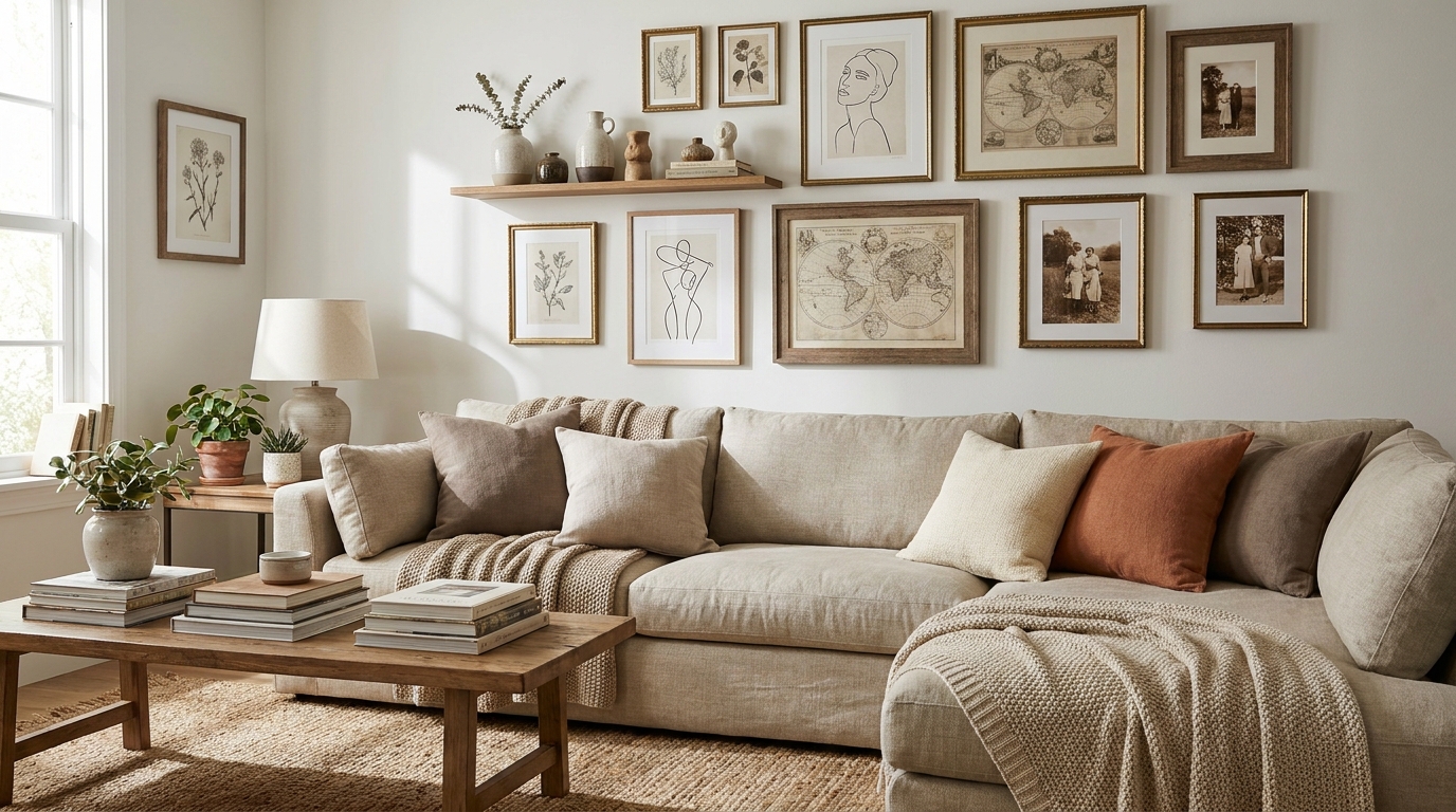
Living room gallery wall ideas can feel simple until you’re standing in front of a blank wall, a stack of frames, and a tape measure that suddenly seems too short. For renters and first-time homeowners, the challenge isn’t just picking art. It’s making the whole wall feel intentional without drilling a hundred holes, spending a fortune, or ending up with a layout that looks crowded from the sofa and empty from the doorway. That’s where a clear plan helps.
In this guide, we’ll walk through the layout decisions that make a living room gallery wall feel balanced, plus the styling moves that keep it from looking random. We’ll cover how high to hang it, how to mix frame sizes, what to do with awkward walls, and which renter-friendly hanging methods actually hold up in real living rooms. We’ve tested the common layouts, compared them in our own styling work, and seen which ones work best over sofas, consoles, and narrow feature walls. If you’ve been saving inspiration but haven’t started, you’ll leave with a practical way to build a wall that feels finished, personal, and easy to update later.
Key Takeaways
- A gallery wall often looks best when its outer edges stay within 6-12 inches of the furniture below it, according to common interior styling guidance from Houzz 2024.
- For renters, command-style strips and removable hooks can support many lightweight frames, and packs usually start around $12 to $25 at Target and Amazon Basics.
- A cohesive frame finish matters more than perfect symmetry when you want the wall to feel pulled together.
- Our team has found that laying everything on the floor first cuts hanging mistakes and helps you spot spacing issues before a single nail goes in.
- If your wall feels too busy, keep one shared element, like black frames, matting, or a single color family.
How Do You Plan a Living Room Gallery Wall Layout?
The easiest way to plan living room gallery wall ideas is to choose your anchor first, then build around it. That anchor could be a sofa, a console table, a fireplace, or the center of a blank wall. Once that’s set, you can decide whether you want a grid, salon-style layout, linear row, or clustered arrangement. We usually start by measuring the furniture below the wall and mapping the total width of the art zone. A gallery wall that’s too wide can feel scattered, while one that’s too narrow can look unfinished.
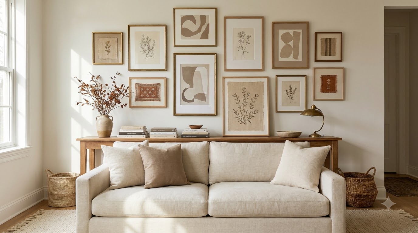
Start with the furniture below it
If your gallery wall sits over a sofa, aim for art that spans about two-thirds to three-quarters of the sofa width. That ratio tends to feel grounded without overwhelming the room. Over a 90-inch sofa, for example, a 60- to 70-inch-wide art grouping usually reads well.
Choose a layout style before you shop
Grid layouts feel clean and structured. Salon walls feel collected and flexible. Linear rows work well above long sectionals or consoles. In our experience styling smaller rentals, the best results come from choosing the layout first and then buying frames to fit that shape.
What Frame Mix Works Best in a Living Room?
The best frame mix is one that looks varied but still related. You don’t need every frame to match, but you do need a shared thread. That might be color, finish, frame thickness, or mat color. We’ve compared all-black, all-wood, and mixed-metal walls, and the most forgiving approach for living rooms is a limited palette: black, oak, white, or brass with one accent material. IKEA’s RIBBA frames start around $9, while CB2 and West Elm frames often land between $29 and $119, so you can build a polished wall at different budgets.
A smart mix also helps the wall age well. If you know you’ll swap art seasonally, stick with frame sizes that repeat. If you want a more collected feel, blend art prints, photos, textiles, and small objects, but keep the framing consistent enough that the wall doesn’t lose focus.
Keep one unifying detail
Mat color is one of the easiest ways to connect different pieces. White mats make a wall feel lighter. Black mats add contrast. Cream mats can soften bright rooms and work well in warm-toned spaces.
Mix frame sizes on purpose
A good mix usually includes at least one large anchor piece, a few medium frames, and one or two small pieces. That scale variation helps the wall feel designed instead of accidental.
How Do You Hang a Gallery Wall Without Drilling Too Much?
You can hang a gallery wall with very little wall damage if you choose the right hardware and keep the art weight in check. For renters, we like command strips, removable hooks, and picture-hanging strips for lightweight frames, mirrors, and prints. Amazon Basics picture hanging strips often run about $12 to $18, and Command strips usually cost about $8 to $20 depending on size. For heavier pieces, use the room’s existing hardware, lease-approved nails, or a professional-grade hanging method if your landlord allows it.
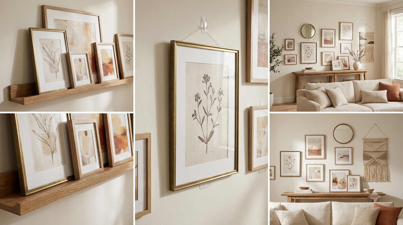
The key is to match the hanger to the weight. A lightweight print in a thin frame is a different job than a framed mirror or canvas. We’ve seen too many walls fail because every piece got the same hardware. Check the frame’s weight, then choose strips or hooks rated above it. If you’re planning a no-drill wall, keep heavy glass to a minimum and use acrylic glazing when possible.
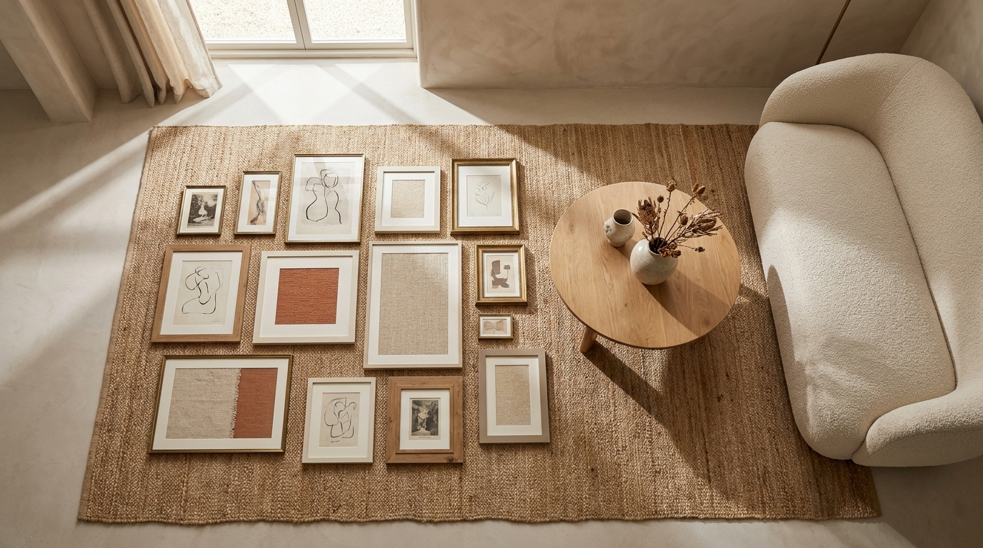
Use a paper template first
Trace each frame onto kraft paper, cut it out, and tape the paper to the wall. This step makes spacing easier, and it’s much less stressful than patching six holes later.
Test the sightline from the sofa
Stand where you usually sit and look at the wall. If the arrangement feels too high, lower it. If it feels compressed, widen the spacing. Our team checks this every time, and it saves the most rework.
What Should You Put in the Center of the Wall?
The center of the wall should carry the strongest visual weight, not necessarily the largest frame. For some rooms, that’s a bold print. For others, it’s a mirror, a textile, or a black-and-white family photo. The center piece sets the tone for the whole arrangement, so choose something that fits the room’s mood. If your living room is neutral, one darker anchor can stop the wall from floating. If your room already has dark furniture, a lighter center piece can open it up.
A good rule is to let the center item do the heavy lifting while the surrounding pieces support it. For example, a round mirror from Target for around $60 can anchor a wall of art prints and family photos. Or you can use a large framed piece from Pottery Barn, where some wood gallery frames start around $199. The center doesn’t have to be the most expensive item, but it should be the most deliberate.
Let one piece lead
If you’re overwhelmed by options, pick the piece you love most and build the wall around it. That usually gives the whole arrangement a more natural hierarchy.
Repeat color from the room
Pull one or two colors from your rug, pillows, or throw blanket so the gallery wall feels tied to the rest of the space.
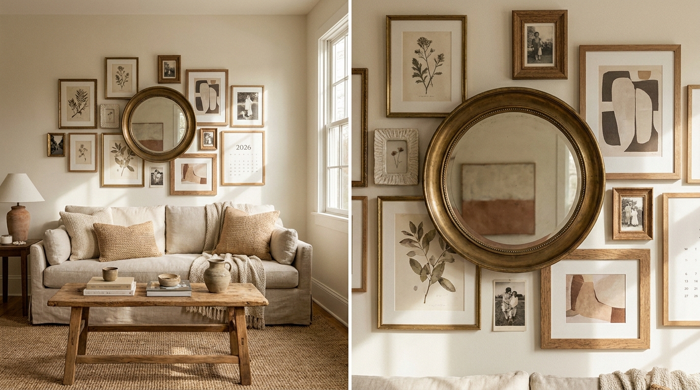
How Do You Style a Gallery Wall So It Feels Collected?
The wall will feel collected when it includes different subject matter, but not too many competing styles. That means mixing art prints, photos, line drawings, and maybe one object, like a small wall basket or framed textile. We like to keep 70-80% of the wall in one visual family and use the rest for contrast. That ratio keeps it interesting without making it look like a collage from five different apartments.
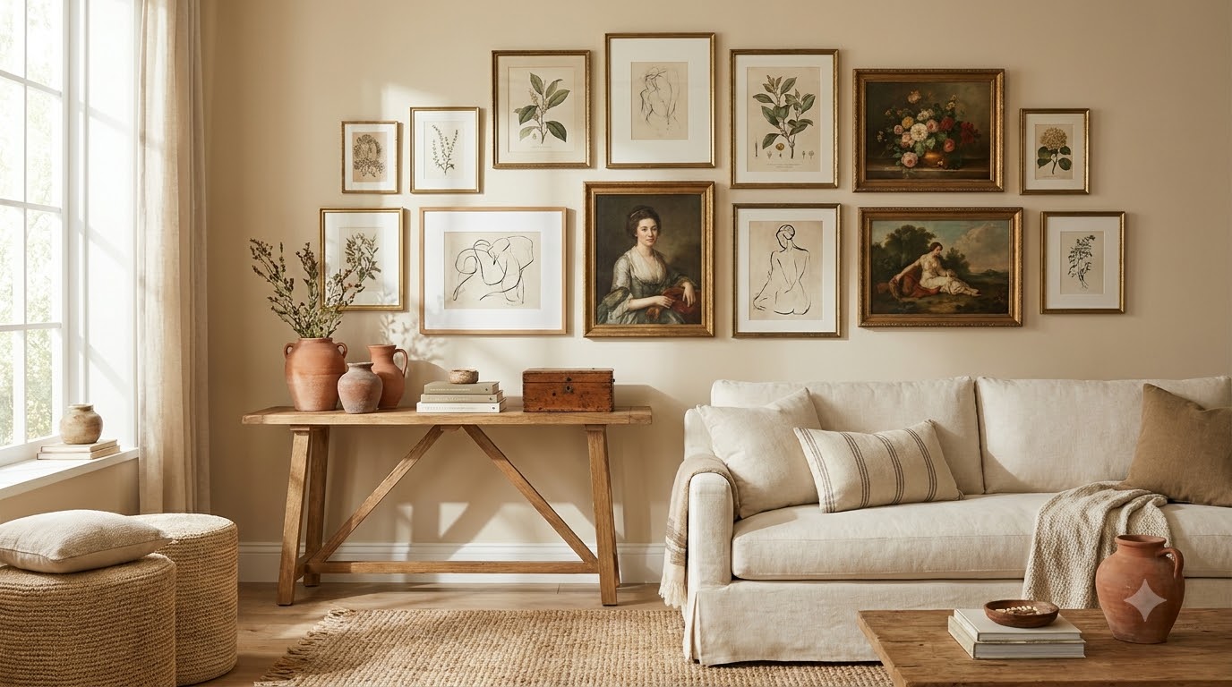
In our experience styling rental living rooms, walls feel most elevated when there’s one repeatable element across the whole set. It could be all black frames, all cream mats, or all warm wood. Then you can add one or two surprise pieces, like a vintage landscape or an abstract print in a stronger color. That contrast adds personality without chaos. If you want a place to start, see our gallery wall frame guide for sizing basics.
Add one non-art item
A small mirror, sculptural object, or woven piece can break up a wall of flat frames and make the arrangement feel more layered.
Edit harder than you think
If a piece doesn’t fit the color story or scale, leave it out. Empty space is often what makes the wall breathe.
What Are the Best Layouts for Awkward Living Room Walls?
The best layouts for awkward walls usually simplify the problem instead of fighting it. Long, narrow walls do well with a horizontal row or staggered pairings. Tall walls often need vertical movement, so you can stack frames above each other or create a tall salon cluster. Corners work better with smaller groupings that turn the eye rather than boxing the space in. If you’re dealing with a wall interrupted by vents, outlets, or windows, build around the obstruction instead of trying to hide it completely.
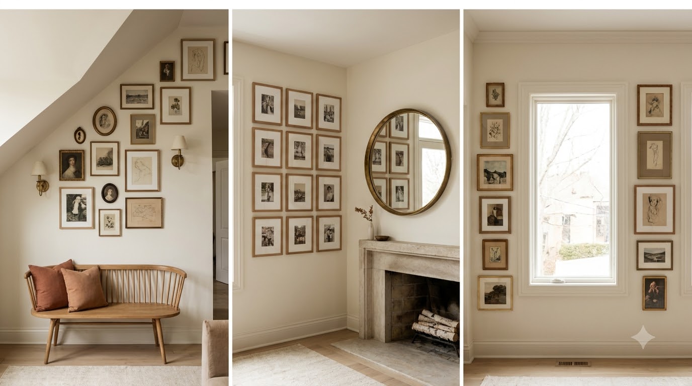
A flexible layout can also save you money because it lets you use frames you already own. We’ve seen renters make the most of awkward spaces by combining two larger prints with a few small frames and one mirror. That kind of mix can look intentional when the spacing is consistent. For more small-space wall strategies, check our small apartment wall decor ideas.
Use the wall’s shape as a guide
A long wall wants width. A tall wall wants height. If you follow the shape instead of forcing symmetry, the room usually feels calmer.
Let negative space work
You don’t need to cover every inch. A little breathing room can make a tight or awkward wall feel more refined.
Which Art Pieces Make a Living Room Feel Personal?
The most personal gallery walls usually include a mix of meaningful and decorative pieces. Family photos, travel prints, children’s art, handwritten notes, and small mementos can all work if you frame them thoughtfully. The trick is to present personal items with the same care as store-bought art. Use matching mats, similar frame widths, or a repeated color palette so the wall still feels cohesive.
If you’re starting from scratch, try a 3-part mix: one personal photo, one abstract print, and one textural or illustrative piece. That mix gives the wall range without making it feel too sentimental or too formal. H&M Home and IKEA both sell affordable frames under $20, which makes it easier to experiment before committing to pricier pieces. We like that approach because it keeps the wall flexible as your style changes. You can swap in new photos or seasonal prints without rebuilding the whole thing.
Balance memory with design
A gallery wall should tell a story, but it still needs structure. Too many sentimental pieces can make it feel busy, so give the eye some room to rest.
How Do You Keep the Spacing Consistent?
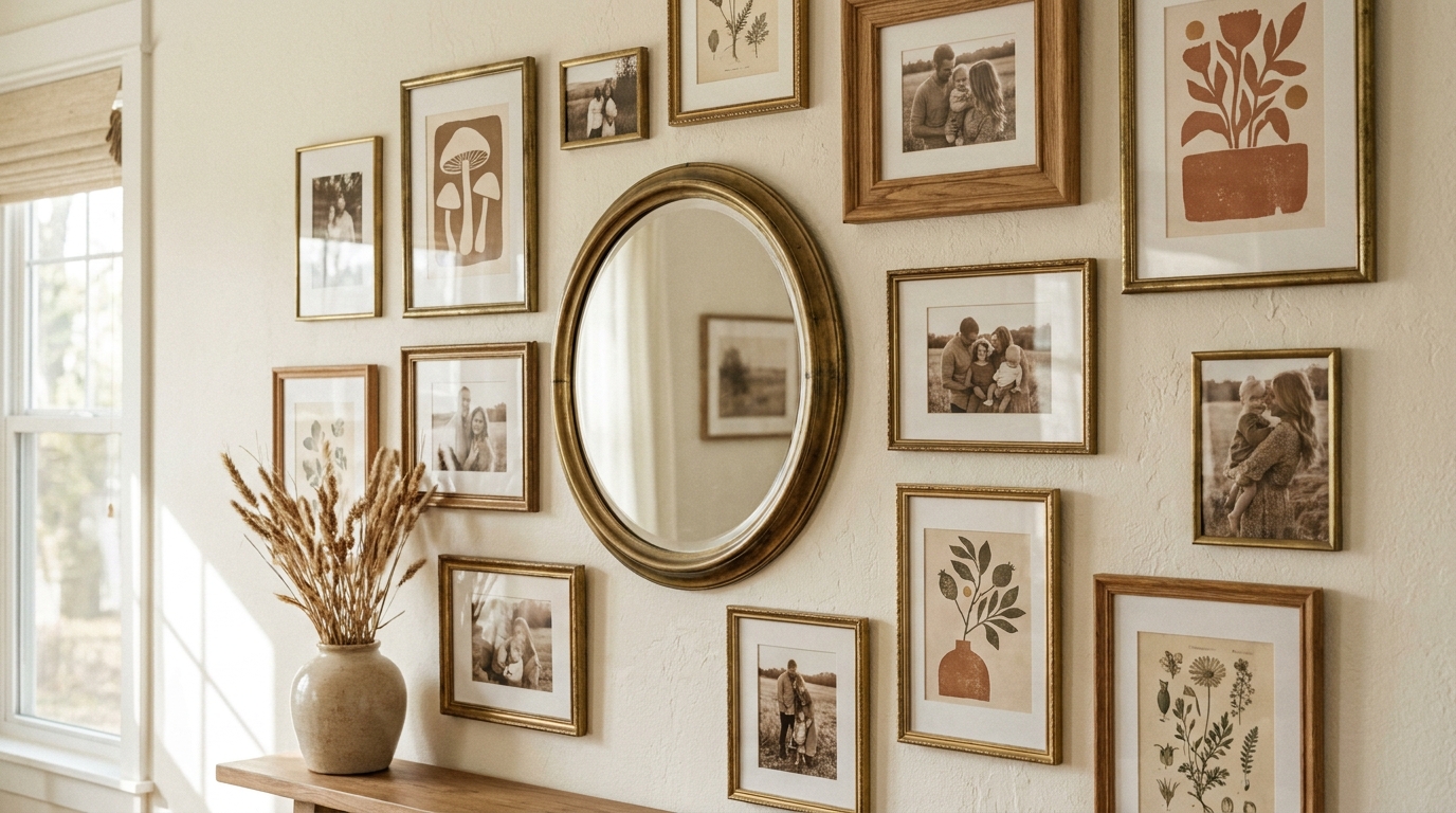
Consistent spacing is what makes a gallery wall look polished. Most walls feel best with 2 to 3 inches between frames, though larger pieces may need a little more room. If the spacing shifts too much, the wall starts to look like a bunch of separate pieces instead of one arrangement. We always measure the gap from edge to edge, not from center to center, because that’s where the eye notices inconsistency.
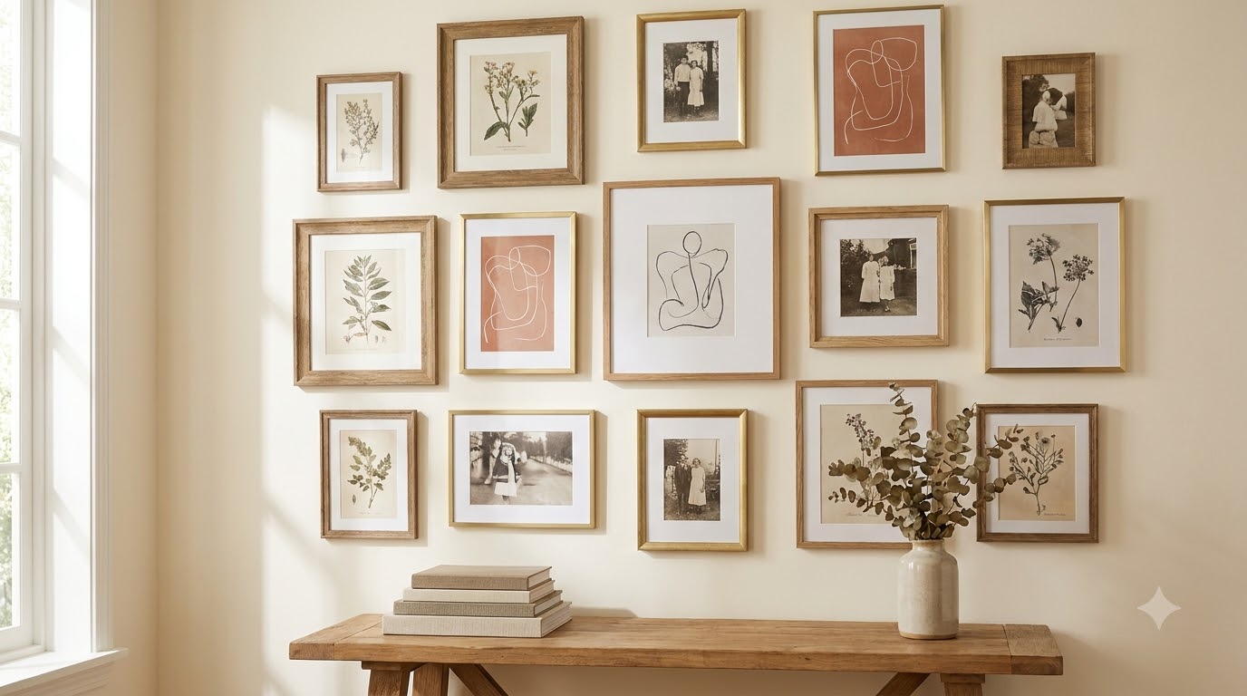
A level, painter’s tape, and a measuring tape are enough to get this right. If your frames are all different sizes, set one grid line for the top or center row and work outward. That gives the arrangement a visual spine. According to Houzz 2024 style guidance, homeowners are still leaning toward layered, personalized walls rather than rigid symmetry, which makes spacing even more important. The wall can be eclectic, but the rhythm should still feel controlled.
Use a spacer block
Cut a small piece of cardboard to your ideal gap size. Move it from frame to frame as you hang, and you’ll stay much more consistent.
Check the wall from across the room
Spacing that looks fine up close can feel uneven from 10 feet away. Step back after every few pieces and adjust as needed.
What Lighting Makes a Gallery Wall Look Finished?
Lighting can make a living room gallery wall look more finished than another frame ever could. If the room already has good natural light, you may only need a nearby floor lamp or table lamp to create a soft glow. If the wall feels dark, consider a plug-in picture light or a slim sconce that doesn’t require rewiring. Rechargeable picture lights from Amazon and Wayfair often start around $35 to $80, and they’re renter-friendly because they don’t need permanent electrical work.
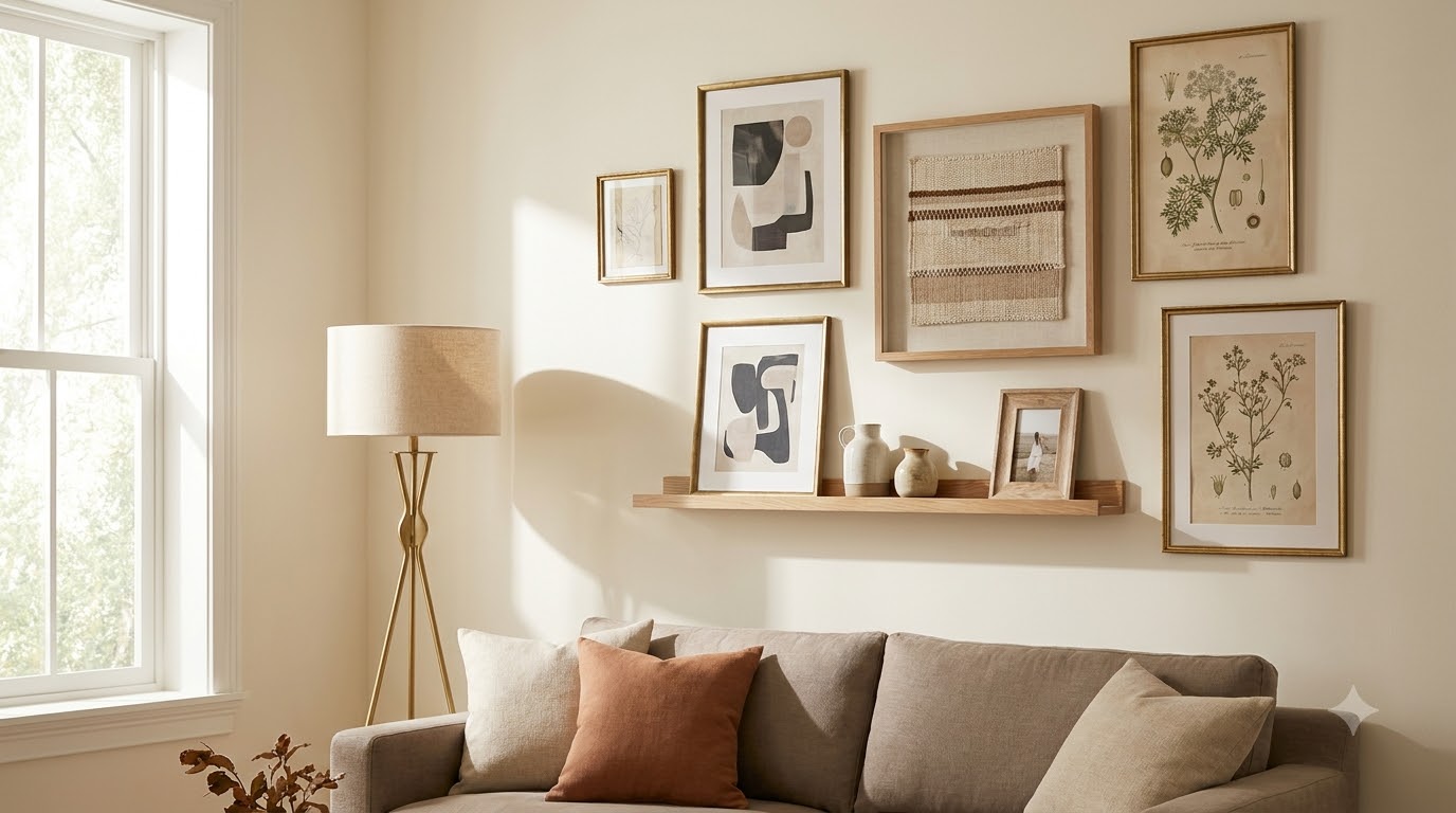
Light also affects how your frames read. Glossy glass can catch glare, while matte prints and acrylic glazing look easier to view from multiple angles. We prefer warm light around 2700K for living rooms because it flatters both color and black-and-white art. If your room uses cool overhead lighting, a warmer lamp near the wall can soften the whole composition.
Avoid over-lighting
One well-placed lamp often does more for the wall than multiple small lights. Too much light can flatten the artwork and make the room feel harsh.
How Can You Refresh the Wall Over Time?
The best gallery walls are flexible, not frozen. You don’t need to rebuild the whole thing every season. Instead, swap one or two pieces when your style changes, when you travel, or when the room gets a new rug or sofa cover. That small turnover keeps the wall from feeling stale and helps it evolve with the rest of the room. In our experience, the easiest refreshes are changing one print, replacing a mat color, or adding a new frame finish.
You can also use a seasonal approach. In warmer months, lighter art and airy mats can make the wall feel more open. In fall and winter, deeper tones and stronger contrast can add depth. If you want a broader styling refresh plan, our living room wall decor ideas article pairs well with this one.
Save a backup art stack
Keep 3 to 5 extra prints or photos in a flat folder. When you want a change, you won’t have to start from scratch.
Frequently Asked Questions
How high should a living room gallery wall hang?
A good starting point is to center the arrangement around eye level, usually about 57 to 60 inches from the floor to the middle of the composition. If it sits above a sofa, keep the bottom edge roughly 6 to 10 inches above the furniture.
What size frames work best for living room gallery wall ideas?
A mix usually works best: one large frame, several medium frames, and a few smaller pieces. Popular sizes include 8×10, 11×14, 16×20, and 18×24. The right mix depends on your wall width and the furniture below it.
Can renters make a gallery wall without damaging walls?
Yes. Lightweight frames can go up with Command strips, removable hooks, and picture-hanging strips. Keep heavier items to a minimum, and always check weight limits before hanging. For larger pieces, use lease-approved hardware if your landlord allows it.
Should all frames match on a gallery wall?
No. Matching frames can look clean, but mixed frames can feel richer and more personal. The key is to keep one detail consistent, like color, finish, or mat style, so the wall still reads as one composition.
How many pieces should a living room gallery wall have?
There’s no fixed number. Most living rooms look balanced with 5 to 9 pieces, but larger walls can support more. Start with the space you have, then adjust until the arrangement feels full without crowding the wall.
Conclusion
The best living room gallery wall ideas don’t start with shopping. They start with a plan. Once you know your anchor, your layout, and your frame palette, the rest becomes much easier. You’ll make fewer holes, buy fewer mismatched pieces, and end up with a wall that feels like it belongs in the room.
If you’re still choosing a style direction, start small and build slowly. Mix one personal piece with a few simple prints, keep your spacing consistent, and let the wall evolve over time. For more layout help, pair this guide with our gallery wall frame guide so you can size and hang with more confidence.
Related reading
- Gallery Wall Color Palette: How to Mix Frames and Art
- Staircase Gallery Wall Ideas: 15 Layouts That Work