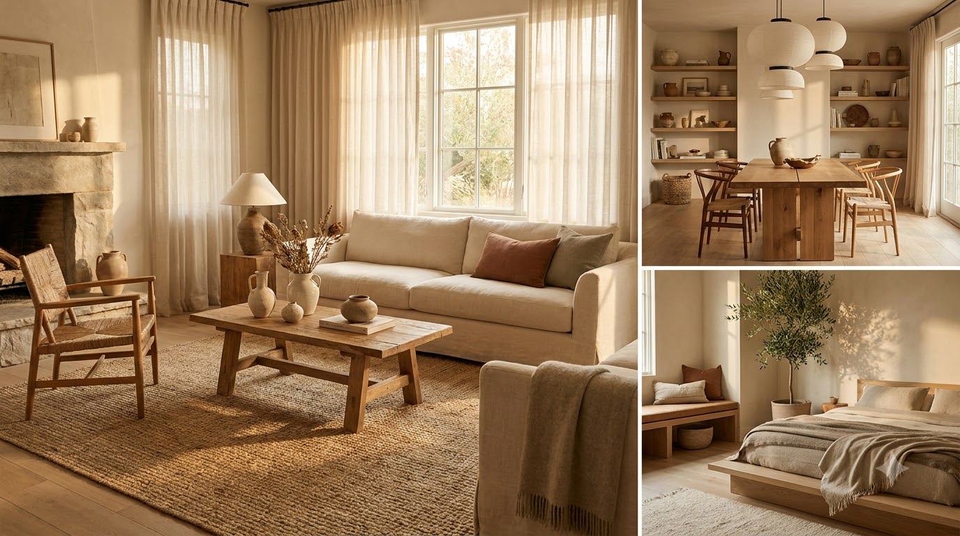
Japandi is the calm, uncluttered look that happens when Japanese minimalism meets Scandinavian warmth. In plain terms, it is a hybrid style built on a simple formula: warm neutral colors, natural materials, low-slung furniture, generous negative space, and a wabi-sabi love of imperfect, handmade things. If you rent, decorate on a budget, or live in a small apartment, this is one of the friendliest aesthetics to adopt, because it rewards owning less and choosing better rather than buying more. Below, we walk you through the principles, the palette, the materials, and the exact budget swaps we use to get the look for under a few hundred dollars.
Key Takeaways
- The formula: warm neutrals + natural materials + low furniture + negative space + wabi-sabi imperfection.
- The palette: build on oat (#E7DCC6), ground with warm walnut (#5C4433), anchor with soft black (#2B2724), and refresh with a muted sage.
- The materials: oak, linen, paper, and clay do the heavy lifting; skip high-gloss plastic and chrome.
- The ratio: “less but better” means roughly one considered piece where you might otherwise use three.
- The budget: you can shift a room with swaps in the $15–$120 range, no full furniture replacement required.
What is Japandi style?
Japandi is a design philosophy that blends two traditions with a surprising amount in common. Japanese interiors prize restraint, craft, and negative space (the beauty of what you leave out). Scandinavian interiors prize comfort, light woods, and hygge—that feeling of cozy, unhurried ease. Put them together and you get rooms that feel quiet but never cold, sparse but never sterile. The Japanese half keeps you from over-decorating; the Scandinavian half keeps the result warm and livable.
When we first tested Japandi in our own small rental, the biggest shift was mental, not financial. We stopped asking “what can I add to this corner?” and started asking “what can I take away?” That single question did more for the look than any purchase. The style is defined by a few core principles working together:
- Warm neutrals over stark white. Think oat, clay, mushroom, and greige rather than bright white or gray.
- Natural, tactile materials. Wood grain, nubby linen, matte ceramic, and paper you actually want to touch.
- Low, grounded furniture. Pieces that sit closer to the floor make ceilings feel taller and rooms feel calmer.
- Intentional negative space. Empty surfaces are a feature, not a to-do list.
- Wabi-sabi imperfection. A hand-thrown mug or a linen with visible slubs is prized, not flawed.
- Function first. Every object earns its place by being useful, beautiful, or both.
The Japandi color palette: warm neutrals with quiet contrast
Color is where Japandi earns its warmth. The rule of thumb we follow is a roughly 60/30/10 split: about 60 percent light neutral on walls and large surfaces, 30 percent mid-tone wood and textiles, and 10 percent deep accent for grounding. Keep everything muted and slightly earthy—nothing should read as “bright.” These are the four anchor tones we build almost every Japandi room around:
- Oat (#E7DCC6) — the base neutral for walls, bedding, and large upholstery. Warmer and softer than white.
- Warm walnut (#5C4433) — the mid-tone wood note for furniture, frames, and shelving.
- Soft black (#2B2724) — a near-black used sparingly for legs, hardware, and a single grounding object.
- Muted sage — a dusty, grayed-green that stands in for “color” without shouting; perfect for a plant, a throw, or ceramics.
Notice there is no bright accent color in that list. In Japandi, the “pop” comes from contrast in tone and texture—matte black against pale oak, smooth clay against nubby linen—rather than from a bold hue. If you want life in the room, let a plant or a bowl of fruit be the color. For low-effort greenery that fits the palette, our roundup of best low-maintenance indoor plants for beginners pairs well with these tones.
Materials and furniture: oak, linen, paper, and clay
If the palette sets the mood, materials do the storytelling. Japandi leans almost entirely on natural, humble materials with visible texture. When we shop, we run a quick test: would this object feel good in the hand and age gracefully? Plastic and high-gloss finishes usually fail; wood, stone, and fiber usually pass. Here are the four material families to prioritize:
- Oak (and other light woods): ash, beech, and pale walnut for tables, stools, and shelving. Matte or oiled, never glossy.
- Linen: curtains, bedding, cushion covers, and slipcovers with a relaxed, slightly wrinkled drape.
- Paper: rice-paper lampshades, folding screens, and unframed prints that diffuse light softly.
- Clay and ceramic: hand-thrown mugs, matte vases, and stoneware in earthy, imperfect finishes.
Furniture follows the same logic, with one extra rule: keep it low and leggy. Low platform beds, a short coffee table, floor cushions, and sofas with slim exposed legs all create the grounded, airy feeling Japandi is known for. Slim legs matter because they let light and floor show through, which makes a small apartment breathe. Aim for fewer, larger pieces with clear negative space between them rather than many small ones crowding the walls. When you plan a seating layout, our guide to cozy living room ideas and layout shows how to keep pathways open while the room still feels warm.
Japandi vs. Scandinavian vs. Minimalist: how they differ
Japandi is often confused with its two parent styles and with plain minimalism. They overlap, but the emphasis differs. This table breaks down where each one lands:
| Element | Japandi | Scandinavian | Minimalist |
|---|---|---|---|
| Palette | Warm earthy neutrals + deep accents | Bright, light, airy whites and pale wood | Monochrome, high-contrast white/black |
| Mood | Calm, grounded, tactile | Cozy, cheerful, bright | Clean, precise, cool |
| Materials | Oak, linen, paper, clay | Light wood, wool, sheepskin | Glass, metal, lacquer, concrete |
| Furniture | Low, slim-legged, handcrafted | Functional, softened, light-toned | Sleek, geometric, hidden storage |
| Imperfection | Celebrated (wabi-sabi) | Tolerated | Avoided |
| Decoration | Very sparse, intentional | Moderate, comfort-driven | Near zero |
The short version: Scandinavian is warmth-forward and bright, minimalism is precision-forward and cool, and Japandi sits in the middle—warm like Scandi, restrained like minimalism, and richer in texture than either. If you already own Scandinavian-leaning furniture, you are closer than you think; swapping bright whites for warm oat tones and adding a single deep accent often carries the room most of the way there.
How do you get the Japandi look on a budget?
Here is the good news for renters: Japandi is a subtraction style, and subtracting is free. The most effective first move costs nothing—clear your surfaces down to a few intentional objects and let the empty space read as calm. From there, a handful of low-cost swaps do most of the visual work. These are the changes we reach for first, with rough price ranges:
- Swap synthetic curtains for washed linen panels — roughly $30–$60 a pair, and instantly softer light.
- Trade a busy duvet for solid oat or greige bedding — about $40–$90, the single biggest change in a bedroom.
- Replace a plastic lampshade with rice paper — around $15–$40 for a warmer, diffused glow.
- Add one matte ceramic vase or bowl — $12–$35, ideally hand-thrown or thrift-store found.
- Layer a jute or wool-blend rug in a neutral tone — $50–$120 to warm the floor and define a zone.
- Paint one wall or a thrifted piece in a warm neutral — a $25–$45 quart of paint reframes the whole room.
A few habits stretch a small budget further. We buy secondhand solid wood over new particleboard because it ages into the wabi-sabi look for free, and small imperfections only add to the character. We shop our own home first, moving a wooden stool or a plain bowl into view before buying anything new. We also keep a short “one-in, one-out” rule so surfaces never drift back toward clutter. And we resist the urge to “finish” a room quickly—empty space now beats a cheap filler purchase you replace in six months. Patience is genuinely part of the budget here; the look compounds as you slowly trade in better, more natural pieces over time. For a full bedroom application of these ideas, our aesthetic bedroom ideas guide walks through layouts that stay calm on a renter’s budget.
Styling small spaces the Japandi way
Japandi and small apartments are a natural match, because the style treats emptiness as an asset. A few space-aware moves keep a compact room feeling open rather than bare:
- Keep the floor visible. Slim-legged furniture and a single low table make square footage feel larger.
- Stick to one wood tone. Repeating the same oak or walnut across pieces reads as intentional, not mismatched.
- Choose one hero object per surface. A single vase on a shelf says more than a cluster of trinkets.
- Bring in living greenery, sparingly. One sculptural plant grounds a corner without cluttering it.
- Use soft, layered lighting. A paper-shaded lamp beats a harsh ceiling light for the Japandi mood.
One more small-space habit we swear by: give every zone a moment of stillness. In a studio, that might mean leaving the wall above the bed bare except for a single unframed paper print, or keeping the kitchen counter clear apart from one wooden board and a ceramic jar. The eye needs somewhere to rest, and in Japandi that rest is the whole point. Greenery is the easiest way to add the “10 percent” of life the palette calls for, and it doubles as texture. If you want plants that thrive on neglect and suit the muted look, our complete guide to indoor plants in home decor covers placement and pairing in detail.
Frequently asked questions
What colors are used in Japandi decor?
Japandi uses warm, earthy neutrals as its foundation—oat (#E7DCC6), warm walnut (#5C4433), and soft black (#2B2724)—with a muted sage or clay tone standing in for color. Everything stays low-saturation and slightly warm. Contrast comes from tone and texture rather than any bright accent hue.
Is Japandi expensive to decorate?
Not necessarily. Because Japandi values owning less, the first and best step—clearing surfaces and creating negative space—is free. Most transformative swaps, like linen curtains, neutral bedding, or a paper lampshade, fall in the $15–$120 range, so you can shift a room without replacing major furniture.
What is the difference between Japandi and minimalism?
Minimalism aims for precision, cool tones, and near-empty rooms, and it tends to hide imperfection. Japandi keeps the restraint but adds warmth, natural texture, and a wabi-sabi appreciation for handmade, imperfect objects. In short, Japandi is minimalism made cozy, tactile, and a little more forgiving.
Can renters do Japandi without renovating?
Absolutely. Japandi relies on textiles, lighting, and decluttering rather than construction, so almost everything is removable. Swap in linen and neutral bedding, add a paper lamp and a jute rug, keep surfaces clear, and choose low furniture. None of it requires permission from a landlord or a single hole in the wall.
What materials define the Japandi look?
Four material families define it: oak and other light woods, washed linen, paper (in lampshades and screens), and clay or matte ceramic. All are natural, tactile, and improve with age. Avoid high-gloss plastic, chrome, and lacquer, which read as too slick for the warm, handcrafted feeling Japandi is built on.
Start with one room, subtract before you add, and let the empty space do its quiet work. That is the whole Japandi practice in a sentence—and the reason it fits a renter’s budget so gracefully.