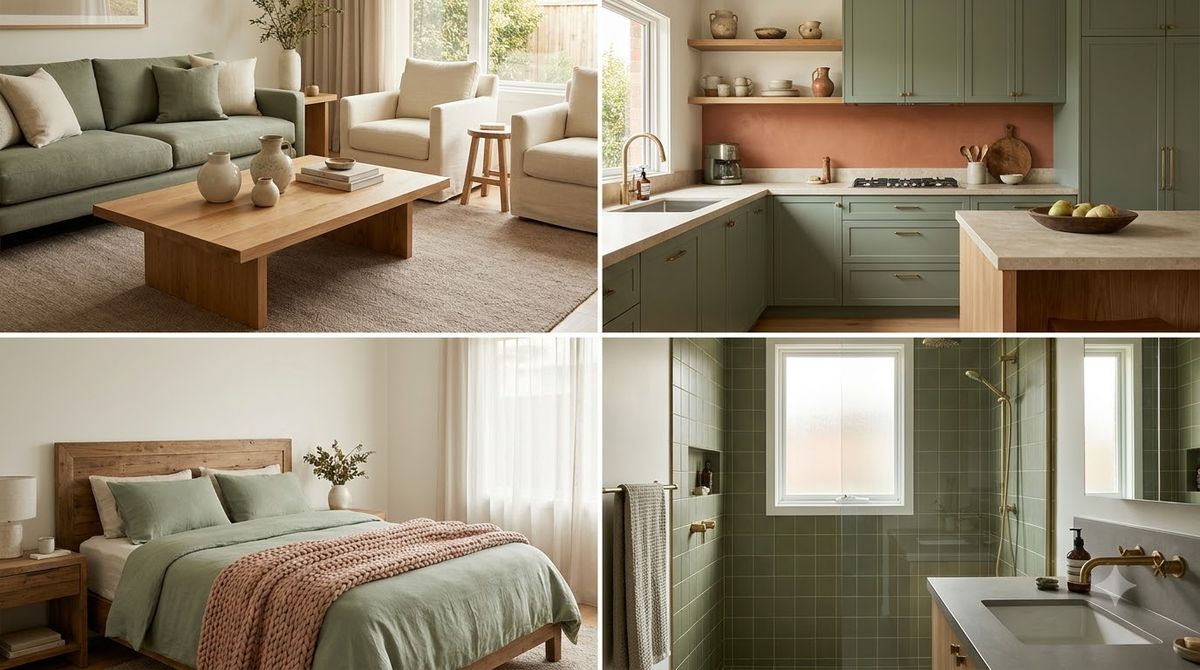
Sage green pairs best with warm neutrals and natural textures: cream (#F1E9DA), terracotta (#C4785A), oak wood tones, brushed brass, and charcoal (#3A3A38). Anchor a room in sage green (#A8B49A), balance it with one warm neutral, then add a single accent, and you get a calm, grounded palette that flatters rentals and small spaces without a single drop of paint. Below we share the exact hex codes, the pairings that work most reliably, and how to split them using the 60/30/10 rule so nothing feels muddy.
Key Takeaways
- Sage green (#A8B49A) is a muted, gray-tinted green that reads as a soft neutral, so it plays well with almost any warm accent.
- The safest pairings are cream (#F1E9DA), terracotta (#C4785A), natural oak, brass, and charcoal (#3A3A38).
- Use the 60/30/10 rule: 60% dominant color, 30% secondary, 10% accent, to keep a sage palette balanced.
- Renters can bring in sage through textiles, art, and plants, no landlord permission and no paint deposit required.
What is sage green, exactly?
Sage green is a soft, grayed-down green named after the herb, sitting somewhere between gray, green, and a whisper of beige. Its muted quality is what makes it behave more like a neutral than a bold color. Treat a sage throw and a set of sage cushions the way most people treat gray, as a backdrop rather than a statement, and a room tends to feel calmer.
Here are four common sage shades, from lightest to deepest:
- Light sage (#C7D0BD): airy and almost mint-adjacent, ideal for small rooms that need to feel bigger.
- Classic sage (#A8B49A): the true middle-ground shade most people picture, balanced and endlessly flexible.
- Deep sage (#7C8A6E): moodier and more saturated, great as an accent on a single cushion or vase.
- Gray sage (#9AA396): the coolest of the group, leaning toward greige for a more architectural feel.
What colors go with sage green?
Sage green pairs beautifully with warm neutrals, earthy accents, and metallics. Because sage carries a gray undertone, it needs warmth nearby so a room does not tip cold. These are the pairings to try first, each with a hex code you can match against paint chips, fabric, or a phone screen:
- Cream (#F1E9DA): the softest partner, brightens sage without the harsh contrast of pure white.
- Terracotta (#C4785A): a warm clay tone that makes sage feel sun-washed and Mediterranean.
- Natural oak (#C8A97E): honey-toned wood grounds sage and adds instant coziness.
- Brushed brass (#B08D57): a metallic accent that reads as jewelry for the room.
- Charcoal (#3A3A38): a near-black anchor for lamp bases, frames, and hardware that sharpens the whole palette.
- Soft blush (#E7C9BE): a gentle pink that leans sage into a more romantic, feminine direction.
- Warm white (#F6F2E9): for trim and ceilings so sage never feels flat.
If you only remember three, make them cream, terracotta, and oak.
How do you use the 60/30/10 rule with sage?
The 60/30/10 rule is a simple ratio for splitting any color scheme: 60% goes to your dominant color, 30% to a secondary color, and 10% to an accent. It stops a room from feeling either washed out or overloaded. Here is how the split typically works when sage is the star:
- 60% dominant, warm neutral: walls, large rugs, and the sofa in cream (#F1E9DA) or warm white (#F6F2E9).
- 30% secondary, sage green: curtains, an accent chair, bedding, or a large area of textiles in classic sage (#A8B49A).
- 10% accent, earthy or metallic: throw pillows, art, and hardware in terracotta (#C4785A) or brass (#B08D57).
You can also flip it: make sage the dominant 60% on a painted feature wall (if you own) or through a large sage sectional, then let cream carry the 30% and charcoal handle the 10%. The ratio matters more than which color sits in which slot. For a fuller walkthrough of layering colors and layouts in a lounge, our cozy living room ideas and layout guide breaks it down room by room.
A common mistake is ignoring the ratio and putting sage on nearly everything: the curtains, the bedding, and a rug. That tends to read as flat and slightly institutional. Pulling sage back to a secondary role and letting cream take over usually fixes it. Sage is a supporting actor that looks best with a warm neutral in the lead.
Sage green pairings by mood and room
Not every pairing suits every room. A combination that feels grounding in a bedroom can feel too sleepy in a busy kitchen. The table below maps each sage pairing to the mood it creates and the room where it suits best:
| Sage pairing | Mood it creates | Best room |
|---|---|---|
| Sage (#A8B49A) + cream (#F1E9DA) | Calm, soft, restful | Bedroom |
| Sage (#A8B49A) + terracotta (#C4785A) | Warm, earthy, inviting | Living room |
| Sage (#A8B49A) + oak (#C8A97E) | Natural, grounded, cozy | Dining nook |
| Sage (#A8B49A) + brass (#B08D57) | Elevated, polished, warm | Bathroom |
| Sage (#A8B49A) + charcoal (#3A3A38) | Modern, crisp, high-contrast | Home office |
| Sage (#A8B49A) + blush (#E7C9BE) | Romantic, gentle, fresh | Entryway |
How can renters decorate with sage green?
Renters can build a full sage palette without touching the walls by layering removable textiles, art, and greenery. Every item below comes back with you when the lease ends, which makes them a good fit for a rental:
- Sage throw and cushions: the fastest, cheapest way to introduce the color to a sofa or bed.
- Peel-and-stick wallpaper: a sage botanical print behind a bed reads as a headboard and peels off cleanly.
- Sage curtains: floor-length panels add the largest hit of color and soften rental windows.
- Framed art with sage tones: leaning prints on a shelf avoids nail holes entirely.
- Live plants: real foliage echoes sage naturally and warms up a hard rental interior.
- Ceramic vases and bowls: small deep-sage (#7C8A6E) objects act as your 10% accent.
Plants do double duty here, adding the exact green undertone that a sage scheme wants. If you are choosing greenery to sit alongside a sage palette, our best indoor plants for bedroom decor guide and our broader indoor plants home decor guide cover the low-light, low-effort options that survive small apartments.
What are the best sage green palettes for small spaces?
In small spaces, lighter sage shades and high-contrast accents keep a room from feeling cramped. Keep the dominant color pale, then let a couple of small dark or metallic pieces add depth without eating square footage. Three palettes to try:
- The airy studio: warm white (#F6F2E9) walls, light sage (#C7D0BD) bedding, oak (#C8A97E) furniture, brass (#B08D57) accents.
- The moody nook: cream (#F1E9DA) base, deep sage (#7C8A6E) accent chair, charcoal (#3A3A38) shelving, terracotta (#C4785A) throw.
- The soft retreat: classic sage (#A8B49A) curtains, blush (#E7C9BE) cushions, cream bedding, natural oak nightstand.
For a full sage-forward bedroom scheme with layout ideas, our aesthetic bedroom ideas guide shows how these palettes translate into a real, liveable room on a budget.
How do you test a sage palette before you commit?
Before spending on curtains or a sofa, gather your colors in one spot and live with them for a few days. Screens and store lighting lie, and sage is especially sensitive to the warmth of the light around it. This is a low-cost checklist to run in any room:
- Build a physical swatch board: tape a sage fabric sample next to your chosen cream (#F1E9DA) and accent, then set it against the wall.
- Check it in three lights: morning daylight, afternoon sun, and warm evening lamplight, since sage shifts noticeably in each.
- Start with one hero piece: a single sage throw or cushion tells you whether the undertone works in your space.
- Add the accent last: layer in terracotta (#C4785A) or brass (#B08D57) only once the sage-and-neutral base feels right.
Keep a small basket of sage samples by the window and swap accents in and out over a weekend. It costs almost nothing and can save you from an expensive mismatch, such as a deep-sage rug that looks gray-green online but turns olive under warm bulbs.
Is sage green still in style in 2026?
Yes, sage green remains firmly in style in 2026 because it functions as a warm neutral rather than a trend color. Trends move fast, but muted, nature-derived tones like sage tend to stick around the way beige and greige have. Sage reads as timeless precisely because it is quiet: it supports whatever else you put in the room instead of competing with it.
A few reasons sage keeps earning its place in homes:
- It behaves like a neutral: you can redecorate around it without repainting or reupholstering.
- It flatters natural materials: oak, rattan, linen, and clay all sit happily beside it.
- It calms a space: the gray undertone keeps it restful rather than energizing.
- It scales down: a single sage cushion works as well as a whole sage sofa.
Frequently asked questions
Does sage green go with gray?
Yes, sage green works with gray because sage already carries a gray undertone. Pair classic sage (#A8B49A) with a warm greige rather than a cold slate gray to avoid a flat, chilly result. Add one warm accent like oak or brass so the combination feels intentional instead of washed out.
What is the complementary color to sage green?
On the color wheel, the complement of green sits in the red-to-terracotta range, which is why terracotta (#C4785A) and soft blush (#E7C9BE) look so natural beside sage. These warm, earthy reds balance sage’s coolness. For a subtler version, dusty rose works too, giving contrast without the boldness of a true red.
Is sage green good for a small room?
Sage green suits small rooms well, especially in lighter shades like #C7D0BD. Its muted, receding quality keeps walls from closing in, and paired with warm white it can even make a space feel larger. Keep the palette simple, one sage, one neutral, one accent, so a small room never feels busy.
What metal finishes go with sage green?
Brass (#B08D57) and warm gold are the strongest matches, adding a glow that flatters sage’s earthiness. Matte black and charcoal (#3A3A38) also work for a more modern, high-contrast look. Cool chrome is best avoided, since it can clash with sage’s warm-leaning undertone and make the palette feel disjointed.
Can I mix sage green with other greens?
Yes, layering sage with deeper greens like olive or forest adds depth and a collected, natural feel. Keep sage as the lightest shade and treat the darker greens as accents on cushions or art. Live plants make this easy, bridging the tones so the greens read as a family rather than a mismatch.
However you build it, sage green rewards a light touch: one grounded neutral, one earthy accent, and a bit of brass or greenery to warm it up. Start with a throw and a plant, live with it for a week, and let the palette grow from there.